Behavioral Breakpoints: Beyond Media Queries

Recently, Cloud Four dev Matt Gifford built a slick, responsive off-canvas navigation enhancement for a project (we’ll be releasing the core code shortly, so keep an eye out for Matt’s post about that!).
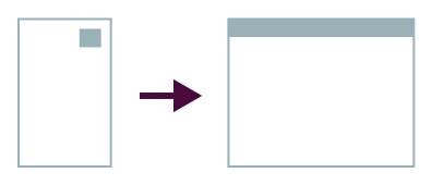
The project followed the off-canvas menu metaphor for handling navigation on narrow screens. The baseline, mobile-first layout keeps the navigation out of the way—initially as footer nav with a button-ish jump link, then progressively enhanced to convert the link into a trigger element for the off-canvas menu—while a media query for wider screens formats the navigation on-screen.
A sketch of this layout adaptation:
In the past we’ve approached implementation of this as:
- Implement a baseline CSS layout that has a menu button.
- Use a CSS media query to adapt the layout for wider screens, hide the button, reflow the nav.
- Use JavaScript, often bound on window.resize, to check media query applicability and adapt behavior accordingly (sometimes alternately handled by looking at the width of the viewport and comparing it to media-query-defined widths).
Bolting on Behavior
Often by the time we get to the behavior implementation of our sites and apps, the process involves bolting on JavaScript as a follower of the CSS-based breakpoints that we’ve generated during the design process. We define the visual breakpoints of our stuff and the JavaScript is expected to use those to indicate how it should behave.
So we bump into things. We want the JavaScript to “know” about the breakpoints defined in CSS, and which media queries are presently active. This leads to heartache, and also some pretty clever hacks. We use matchMedia (or a polyfill to support same) to determine whether a particular, specific media query is active.
Thus: duplicating media queries in two places (CSS and JavaScript), a situation that makes a whole lot of us twitchy. I have definitely fantasized about future CSS module spec revisions that allow for naming and scoping of media queries, to make stuff like this better.
But hold on a minute. What are we trying to accomplish here? Does CSS really hold a monopoly on breakpoints? Should our behavioral components be entirely beholden to the specific formulae of our visual layouts?
(Re-)Defining Breakpoints
But why is the breakpoint for menu/navigation behavioral adaptation entirely linked to a CSS concern? Could there be better indications in the browser that the behavior change is appropriate, beyond a CSS media query or screen width? And, in that case, what does define the breakpoint?
This sort of thing was already on my mind when I started reading Stephen Hay’s excellent new book, Responsive Design Workflow. And Stephen is thinking about these things, too—except he’s already a lot further along!

Stephen’s way of defining a breakpoint is: “the points where certain aspects of a website or web application change depending on specified conditions.”
No mention of CSS there—because the picture is bigger than that. As Stephen continues on to say, “[a]nother reason to consider a more full definition of breakpoints is that CSS is not the only method used to implement changes when a breakpoint has been reached.”
Exactly!
Breakpoint Graphs
To express and plan breakpoints, Stephen advocates the use of breakpoint graphs, an adaptation on bullet graphs he’s invented to communicate both visual and behavioral aspects of breakpoints.
Along the “qualitative” axis (horizontal in these examples), one charts a scale. Often, this is a range of screen width resolutions—the way we tend to think about responsive design and breakpoints.
Using the process from above, we might have a breakpoint graph that looks like this:
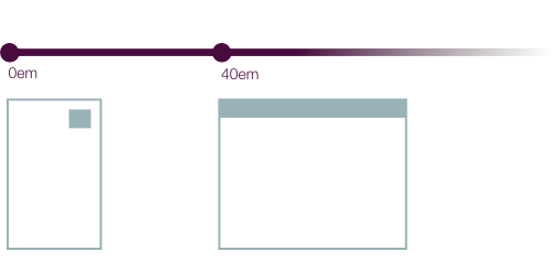
Thus, we’ve expressed that we have a breakpoint at 40em that alters the page layout.
But Stephen’s graphs go further than this visual design element. Using qualitative “bands,” Stephen’s graphs can communicate behavior or other aspects, like so:
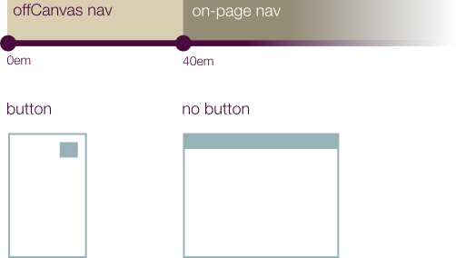
This is starting to move toward thinking about behavioral changes as well as visual ones, expressing explicitly that we want to adapt navigation behavior, but the breakpoint is still owned and defined in terms of the CSS breakpoint: 40em. So it’s natural that we’ve been creating media queries:
@screen only and (min-width: 40em) {}
and the JavaScript corollary
if (window.matchMedia( "screen and (min-width:40em)" )) { }
Behavioral Breakpoints
Looking at breakpoints in such a clear way inspired me. I’d seen the screen-width-resolution-style graphs before, but the qualitative dimension was new and exciting. In fact, it frees us from tying our breakpoints to a visual or CSS source at all.
What is the breakpoint, in the case of the navigation menu example here?
When implementing the navigation behavior, Matt chose to use the state of the triggering button as the indicator for which kind of menu behavior to apply. Button extant and visible? Convert the navigation behavior to the corresponding off-canvas menu. Button gone? Deactivate the off-canvas menu and use on-page navigation. Matt does this by observing the state of that button and reacting accordingly, not by duplicating or checking on the status of the CSS media query that put it there in the first place.
Building Behavior into the Process
A behavior-centric breakpoint graph for this could look something like this:
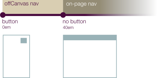
where the breakpoint is the state of the trigger button. Yes, the state changes at 40em as a result of a CSS media query, but it’s the state we care about, not the media query (or window width) that did it.
Stephen’s book does an excellent job of pushing the notion that behavior needs to be a part of our responsive design processes, integrated and partnered with visual design, not just adjunct to or beholden to it. Breakpoints span various aspects of the overall experience, and I’m glad Stephen helped me really understand this.
Thanks!: my gratitude to Stephen Hay for his personalized help in making breakpoint graphs, Matt Gifford for the off-canvas menu idea that got me thinking and Tyler Sticka for a bit of sketching help and proofreading.


