Converting an existing site or app to a responsive design

Over the last few years, we’ve converted quite a few existing sites and applications to responsive web design. We’ve gotten pretty good at it so I thought I’d share our process.
Not a full redesign
Many of our clients have come to us with desktop sites that are working well that they are rightly afraid of messing up.
For example, when we first starting working on the Walmart Grocery site, the main Walmart desktop site had recently undergone a major redesign effort. We liked the new design, and were pleased to see that the designers had already considered touch-friendly targets.

Given how recently Walmart had redesigned the site, any responsive plans that required a full redesign were non-starters. This wasn’t the time to rebrand the site.
In addition, Walmart and many of our other clients are running successful businesses on their desktop sites. They conduct user testing and constantly analyze site usage to optimize performance and profits.
Therefore, our goal has been to convert the site to a responsive web design with as little disruption to the business as possible.
Not a responsive retrofit
At the same time, these projects have been much more extensive than a responsive retrofit. Ben Callahan has written about several techniques for responsive retrofits. In the article, Ben poses the following scenario:
To start over with something like this would be a year long project costing hundreds of thousands of dollars. Is there anything you can do with just CSS to make the existing experience a bit better for smaller screens?
Ben does a wonderful job describing the techniques people can use to apply CSS with scalpel-like precision to start a site on their way to responsive without making major changes to the underlying code. If that’s the constraint you’re working with, I highly recommend his article.
For the most part, our clients have different constraints. They don’t mind changing markup if necessary. And they expect the CSS to change quite a bit.
What they want to preserve is the wide screen experience because that is what is currently working and what their users are accustomed to.
Responsive conversions
If they’re not responsive redesigns and they’re not responsive retrofits, what do we call projects where an organization wants to move to responsive design, but wants to preserve the desktop experience?
For lack of a better term, I’ve been referring to them as responsive conversions.
The desktop experience will have to change some
Clients often seek to preserve the desktop experience for completely understandable reasons. This often leads to a mandate that the “desktop site cannot change.”
Unfortunately, it isn’t possible to convert a site to responsive design without some changes to the wide screen version. Inevitability, there are situations where tweaks to the desktop experience would make the responsive implementation significantly easier.
And more times than not, the changes that come from figuring out how to design the mobile experience make the desktop experience better.
For these responsive conversion projects, our guiding principles have been:
- We will do our best to keep the wide screen experience feeling as close to its current experience as possible.
- Under the hood, we’re free to do whatever is necessary to make the site responsive.
We strive to make the experience better no matter what size screen someone is using.
Breaking the existing site into smaller patterns
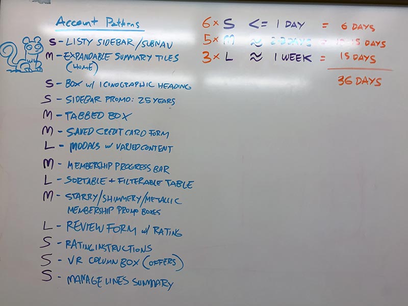
Our first step in converting an existing site into a responsive design is to identify the patterns we think we will need to design.
This process usually consists of a couple of team members sequestering themselves in a room and reviewing the site and writing on sticky notes what patterns they see. This pattern identification provides us with a guide for estimating the time we think projects will take.
Recently, Charlotte Jackson wrote about an exercise that teams can undertake to identify patterns. We’re looking forward to trying this on a future project.
Ordering the patterns into sprints
After we’ve identified the patterns, we start organizing them into sprints. Some of the things we consider when organizing the sprints are:
- In general, we want to start with the smallest patterns and build up to the most complex.
- We check with our client to see if any components are particularly important and need to be addressed earlier. If so, we figure out any dependencies for those components and prioritize them.
- As each sprint passes, our velocity increases as does our ability to tackle more complex components.
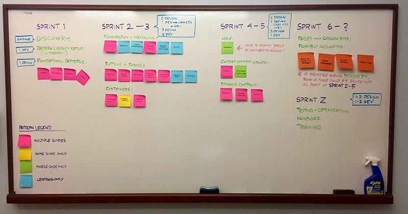
The whole point of agile is to be flexible so this plan isn’t set in stone. But it does give us a starting point and lets our clients know what they need to prepare for each sprint. Our client team plays a huge role in making each sprint successful.
Responsive Design Sprints
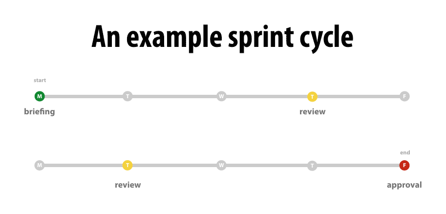
The biggest change to the way we work is that we now design in sprints. Responsive design sprints are a topic worthy of their own article and I plan to write more about them soon.
In the meantime, here are the highlights of the way we approach these design sprints:
- Sprints focus on patterns.
- We work with the client ahead of time to determine what patterns will be tackled in an upcoming sprint.
- At the beginning of each sprint, the client team presents everything they know about the patterns—how and when they are used; what user testing has been done; and any edge cases we need to consider.
- We then start sketching small screen versions of the patterns.
- Once we’ve got a good direction, the team divides up the work and starts designing in the browser.
- We share what we’re designing with our clients nearly every day via Slack so we’re constantly adjusting and refining the designs.
- At the end of our two-week sprint, we’ve got working prototypes of those responsive patterns.
There is much more to say about this process. Read my follow up article on The Power of Responsive Design Sprints.
Rinse and repeat until we’re “done”
Once we start the responsive design sprints, we simply continue the formula until all of the patterns and components that we’ve been tasked to design are complete.
One of the interesting things about this process is that the definition of what “done” means changes from project to project. There are a couple of reasons for this.
First, our client’s engineering team is often responsible for taking our work and integrating it into whatever backend system they use. In these cases, our work can be complete long before the site launched and officially “done.”
Second, we’re frequently asked to teach web teams. On more than one project, we’ve had designers and developers from the client’s team embed inside our team to learn from us.
This means that we start projects with the goal of teaching the team to fish for themselves and once they can, we hand over the project to their designers to finish things up.
The process works
When we’re confronted with a complex fixed-width interface, I often have no idea what the responsive version of that interface will be. But I do know even the most complex interfaces can be converted to a responsive design by breaking them into smaller patterns and designing in sprints.
I have complete faith in the process because I’ve seen it work multiple times. If you’re stuck on a complex responsive design, I recommend giving it a try. If you need help, let us know.
(P.S. You may enjoy my follow up article on the Power of Responsive Design Sprints)
Jason Grigsby is one of the co-founders of Cloud Four, Mobile Portland and Responsive Field Day. He is the author of Progressive Web Apps from A Book Apart. Follow him at @grigs.
