Jeb Bush’s Responsive Images Problem

It’s political season here in the United States, and it is great to see politicians taking technology issues seriously.
Take Jeb Bush for example. His campaign has gone out of its way to highlight the importance of planning the focal point of your responsive images carefully.
On small screens, the web page carefully positions the campaign logo right in the middle of the candidate’s face. This makes sense as there are two Bushes in the photograph so the logo helps us identify which Bush is running this time.

Careful planning ensures that there aren’t any embarrassing crops of the Bush brother we’re focusing on.

At wider screens, the campaign crops out one Bush brother so we can focus in on the signup form. The last thing the campaign wants is for Jeb’s brother to overshadow him.


You can see the full cropping in action at the Jeb Bush SC Signup Page or in the video below:
Alright, I’ve had enough fun at poor Jeb’s expense. This could easily happen to any web site owner.
Jeb Bush’s signup page demonstrates the needs for organizations to coordinate on how photographs will be created and utilized within responsive designs—particularly in cases where cropping will occur in the browser.
And it illustrates why Simon Bächler has started the Universal Images Working Group—a W3C Community Group—to work on embedding art direction rules inside meta data on the image files themselves.
The meta data would contain information on what can be cropped from an image and where the safety area—the area that should never be cropped—is located:
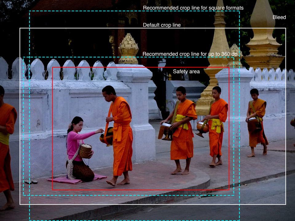
The above image is from the Universal Images Demo page.
This idea is similar to what film and TV have been doing for years to ensure their work is cropped in an acceptable fashion. I’m already seeing organizations adopting this technique for responsive images.
Kevin Mack and Tim Vonderloh presented how they used what they called Asset Template Guides (video, slides) on a client project.
Netflix provides photographers with a prototype of the page in addition to guidelines and a template. “The photographer had the tool to be able to drop the images in as he was shooting them and we could see them in a prototype and see how they would look across screen sizes,” Anna Blaylock explained in an interview.
If you’re interested in working on this problem, the Universal Images Community Group could certainly use your help.
The big lesson here is that if cropping is part of your responsive images strategy, you need to plan ahead to avoid accidentally cropping the most important parts of a photograph.

Thanks to Aileen for pointing out the Jeb Bush sign up page.
Jason Grigsby is one of the co-founders of Cloud Four, Mobile Portland and Responsive Field Day. He is the author of Progressive Web Apps from A Book Apart. Follow him at @grigs.