Responsive Images 101, Part 1: Definitions

Over the last few years, we’ve written a quite a few articles about responsive images. Now that responsive images have landed in browsers, it seemed like a good time to step back and cover the basics for those who are just starting to tackle responsive images.
Ergo, a new series of articles called Responsive Images 101 that will cover everything from why we need responsive images to how to pick the right responsive images solution.
Let’s dig in!
What are Responsive Images?
The idea of having the browser resize images has been a key part of responsive web design from the beginning.
However, simply resizing images can mean that users will download images that are far too large. Take this Apple Watch image:

The largest version of that image, used for large, high density displays like the iMac, is 5144×1698 pixels. It weighs in at 398K.
Delivering an image that large to a device like the Blackberry Curve 9310—with its display resolution of 320×240 pixels—doesn’t make any sense. We need a smaller image.
Therefore, when I talk about responsive images, what I’m referring to is:
A method for providing the browser with multiple image sources depending on display density, size of the image element in the page, or any number of other factors.
Often, when people talk about responsive images, they are referring to solutions for inline images. Why? Let’s take a look at our old friend the <img> element:
<img src="giraffe.jpg" alt="Giraffe">
Code language: HTML, XML (xml)
The fact that <img> only provides for a single image source has been the biggest challenge. But responsive images aren’t limited to HTML. We’ll look at CSS techniques later in this series.
Understanding your use case
When you start looking at responsive images solutions, it can be overwhelming to figure out which solution makes the most sense for your image. The key to knowing what solution will work best is to know what use case you’re solving for.
The Responsive Images Community Group (RICG) defined multiple use cases. I encourage you to read through the full list of use cases—there is some good stuff in there—but for our purposes, I’m going to simplify things into two major use cases: resolution switching and art direction.
Resolution Switching
Resolution switching is the most common use case. It refers to any scenario where you all you want to do is provide different sizes of an image and you’re not making any modifications to the content or aspect ratio of the image.
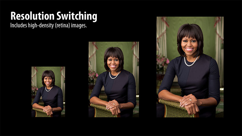
Resolution switching not only encompasses flexible images that change based on the size of the viewport, but also scenarios where you want to provide different image sources based on the display density (a.k.a., retina images).
Art Direction
Whenever you need to make changes to content or aspect ratio of an image based on the size of the image in the page, you’re doing what the RICG refers to as art direction.
Take for example the following photo of President Obama speaking at a Chrysler plant.
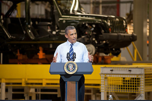
When the image is displayed at larger sizes, it makes sense for the image to show the automobile factory in the background. The background helps explain where the event took place and adds to the image. But look what happens when we scale the image down to fit a smaller screen.
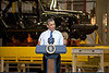
At that size, you can barely recognize Obama. You can’t make out his face. Instead of simply resizing the image, it may make sense to crop the image to get rid of some of the background and focus in on him. The end result is an image that works better at the smaller size:

Art direction isn’t limited to cropping images. For example, on the Nokia site where they showed off the new version of their browser, you can see how the image changes from landscape to portrait based on the size of the screen:
As Stephanie Rieger explained at the Breaking Development conference, the decision was made to change the image so that the browser itself could be seen more easily. If the image shrunk too much, the browser chrome became unreadable which is why the design switches from landscape to portrait.
The most common place I see art direction is for images that contain text. We can see an example at the CB2 site and one of its hero images.
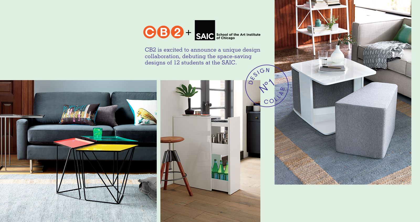
This image contains three photographs, two logos with type in them, and a stamp and text that both use thin strokes. If we simply resized this image to 320 pixels wide, the text would be too small to be readable.

CB2 doesn’t currently have a responsive site, but it does have a mobile web site where we can see how they handle this hero image on small screens.

In order to make the image work on small screens, CB2 does the following:
- Changes from three photographs to two
- Removes text
- Modifies the aspect ratio to make the image taller
- Redesigns the layout of the image
As you can see the changes necessary to make an image work on small screens can be substantial.
Let the games begin
Now that we’ve got the definitions out of the way, we can start looking at how these solutions work. Read more in Part 2: Img Required.
Responsive Images 101 Series
- Currently Viewing:Definitions
- Img Required
- Srcset Display Density
- Srcset Width Descriptors
- Sizes
- Picture Element
- Type
- CSS Responsive Images
- Image breakpoints
- Conclusion
Jason Grigsby is one of the co-founders of Cloud Four, Mobile Portland and Responsive Field Day. He is the author of Progressive Web Apps from A Book Apart. Follow him at @grigs.
