Responsive Images 101, Part 2: Img Required

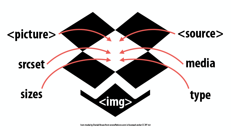
One of the main reasons why we need solutions for responsive images is because the <img> element is insufficient. It only has one src and we need multiple sources.
Given that fact, it may be surprising that we’re going to start by talking about the <img> element instead of the new, shiny toys like <picture> and srcset.
No matter what responsive images solution you use, <img> is required.
The <img> element is critical for all of the inline responsive images solutions. The way I like to think about it is that the img is a box into which all of the responsive image rules are added and applied.1
You can use JavaScript to watch for changes in the currentSrc of the img element. Here is an incredibly simple script that watches for changes and writes them to the page2:
(function() {
  var currentSrc, oldSrc, imgEl;
  var showPicSrc = function() {
    oldSrc     = currentSrc;
    imgEl      = document.getElementById('picimg');
    currentSrc = imgEl.currentSrc || imgEl.src;

    if (typeof oldSrc === 'undefined' || oldSrc !== currentSrc) {
      document.getElementById('logger').innerHTML = currentSrc;
    }
  };

  // You may wish to debounce resize if you have performance concerns
  window.addEventListener('resize', showPicSrc);
  window.addEventListener('load', showPicSrc);
})(window);
Code language: JavaScript (javascript)
You can see this in action on this demo page3. Resize the browser to see the currentsrc change.
Why does this matter?
The fact that the <img> will always show the current source means that any existing JavaScript that interacts with the <img> element will continue to work as expected.
(Not to mention the decades worth of code that browser-makers have written to handle images correctly.)
As Eric Portis puts it, “we’re progressively enhancing the img” when we use the new responsive images standards.
Do you need more than img?
There are some scenarios where the img element alone might be enough:
- A fixed width, single density web page — If you don’t have a responsive design and aren’t worrying about “retina” displays, then the img element is all you need.
- Small differences in file size — For some images there isn’t much difference between the file size of the largest and smallest variants. We’ve seen this with badges, icons and other small images that don’t change much as the viewport changes. If there isn’t much difference in file size, a single img source may suffice.
-
Using vector-based images like SVG — If you’re using a vector-based image format like SVG, the image can scale without providing multiple sources. In that case, you may be able to link directly to the SVG as the single source for the img.
This depends, of course, on whether the browsers you support also support SVG. You may be better off using the picture element to provide alternative image formats as fallbacks—something I’ll cover later in this series.
What if you want to support high-density displays?
If you want to support high-density displays, then we need to supersize our <img> element. Learn how in Part 3 in this series: Srcset Display Density.
Responsive Images 101 Series
- Definitions
- Currently Viewing:Img Required
- Srcset Display Density
- Srcset Width Descriptors
- Sizes
- Picture Element
- Type
- CSS Responsive Images
- Image breakpoints
- Conclusion
Footnotes
- Box icon made by Daniel Bruce from www.flaticon.com and is licensed under CC BY 3.0
- Thanks to Lyza and Erik for helping with the JavaScript.
- Demo page forked from Google Chrome Team picture element example that was used in Pearl Chen‘s great article on Built-in Browser Support for Responsive Images.
Jason Grigsby is one of the co-founders of Cloud Four, Mobile Portland and Responsive Field Day. He is the author of Progressive Web Apps from A Book Apart. Follow him at @grigs.