Responsive Images 101, Part 4: Srcset Width Descriptors

In Part 3, we looked at display density descriptors and concluded that they are great for fixed width images, but are insufficient for flexible images.
Flexible images is where srcset’s width descriptors shine.
Width descriptors
The syntax for width descriptors is similar to that of display density descriptors. The value of the srcset attribute is a comma-separated list of image sources and descriptors.
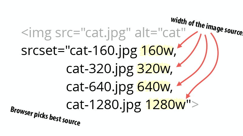
The difference is that instead of having 1x, 2x, and other values representing the density, we now list the width of the image source such as 320w, 480w, etc.
<img src="cat.jpg" alt="cat"
  srcset="cat-160.jpg 160w, cat-320.jpg 320w, cat-640.jpg 640w, cat-1280.jpg 1280w">
Code language: HTML, XML (xml)
The width of the image source can cause some confusion. Width descriptors are looking for the resolution of the source file.
In other words, if you open the image in an image editor, what does it say the resolution is? Grab the width and put it in the srcset attribute.
The browser picks the best source?
When you use width descriptors, you’re providing the browser with a list of images and their true widths so that it can select the best source. How does the browser do that?
Your first instinct is probably to say that the browser looks at the size of the element in the page and compares it to the list of source sizes. That makes sense, but it isn’t how the selection work.
See, when a browser starts downloading images, it often doesn’t know the size of the image in the page.
Browser pre-loader and speculative asset downloading
If you look at a timeline of how a browser renders a page, you’ll notice something striking.
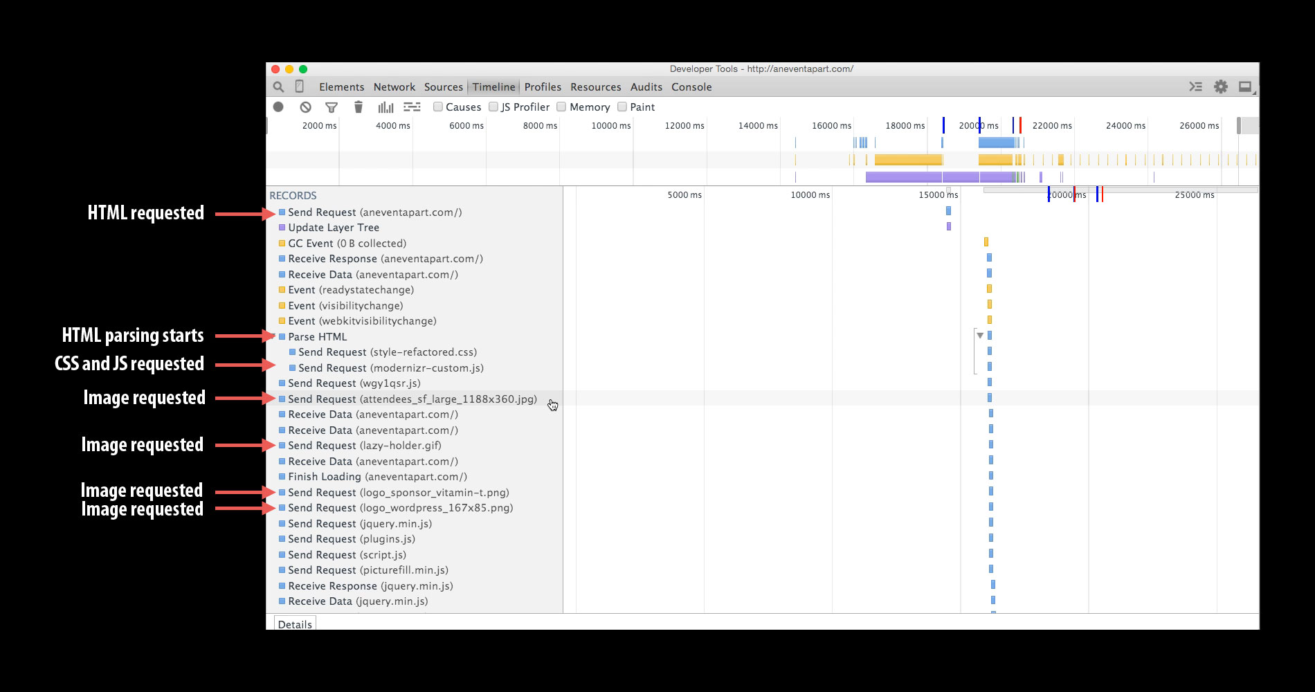
Shortly after the browser downloads the HTML, it requests CSS and JavaScript. But before the CSS and JavaScript is done loading, the browser starts downloading images.
Because neither the CSS nor JavaScript is complete, the browser is downloading images without knowing what the layout of the page will be. And without knowing the layout, it doesn’t know what size the image element will be.
BTW, this pre-loading behavior is why we can’t solve inline responsive images using CSS or JavaScript. They aren’t available when the browser starts downloading.
The only thing that the browser does know is the size of the viewport. Once we move past display density descriptors, everything hinges on the size of the viewport.
Why does this matter?
The viewport can be a poor substitute for the actual size of the image. Take the images on Walmart’s Grocery site:
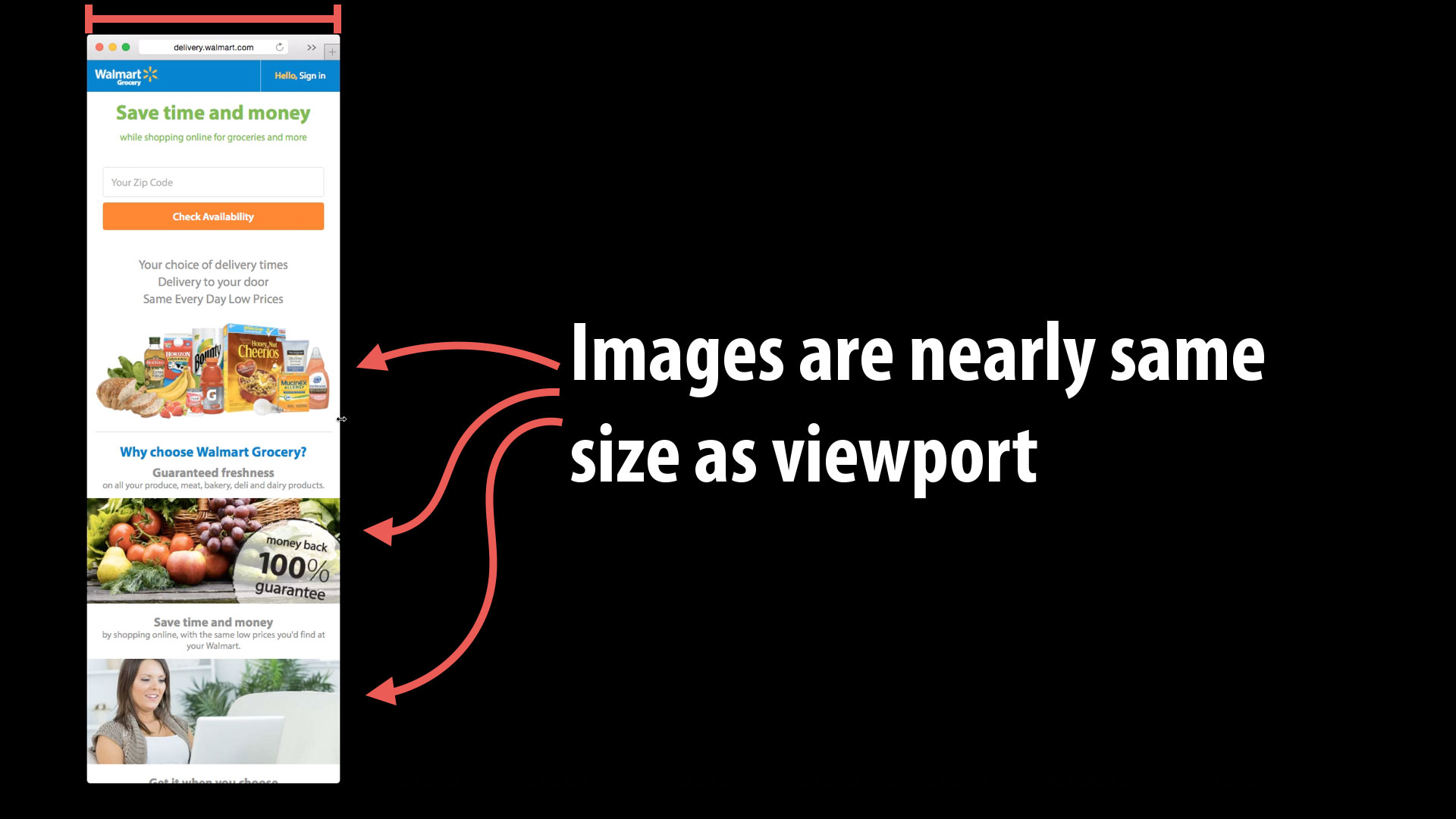
On narrow viewports, the images are nearly the same size as the viewport width. They are certainly close enough to work.
Wider screens, however, are a different matter:

In the second example, the viewport is 1540px wide, but the images are only 254px wide. Knowing the size of the viewport won’t tell the browser enough information to be able to select the right image source.
Sizes to the rescue!
How do we tell the browser about the size of the image in the page so that it can download the right source from our srcset list? Use the sizes attribute!
Read more in Part 5: Sizes.
Responsive Images 101 Series
- Definitions
- Img Required
- Srcset Display Density
- Currently Viewing:Srcset Width Descriptors
- Sizes
- Picture Element
- Type
- CSS Responsive Images
- Image breakpoints
- Conclusion
Jason Grigsby is one of the co-founders of Cloud Four, Mobile Portland and Responsive Field Day. He is the author of Progressive Web Apps from A Book Apart. Follow him at @grigs.
