Responsive Images 101, Part 5: Sizes

When we last left our intrepid web developers, they had discovered the power of srcset width descriptors, only to be faced with a new challenge—the browser only knows the size of the viewport when it begins downloading images.
Now, it is time to meet the hero of our story: the sizes attribute.
Sizes attribute is required!
The sizes attribute is required any time you use srcset width descriptors.
In fact, sizes only makes sense if you’re using the width descriptors. If you’re using the display density descriptors, you don’t need the sizes attribute. The browser won’t know what to do with it.
Sizes syntax
Out of all the new responsive images standards, sizes was the hardest one for me to wrap my head around at first.
Like srcset, the sizes attribute contains a comma-separated list. This comma-separated list describes the size of the image in relation to the viewport.
I want to repeat that point because it is the key to understanding sizes.
We’re telling the browser what size the image will be in relation to the size of the viewport. And we can tell the browser how that relationship changes as the size of the viewport changes.
<img src="cat.jpg" alt="cat"
srcset="cat-160.jpg 160w, cat-320.jpg 320w, cat-640.jpg 640w, cat-1280.jpg 1280w"
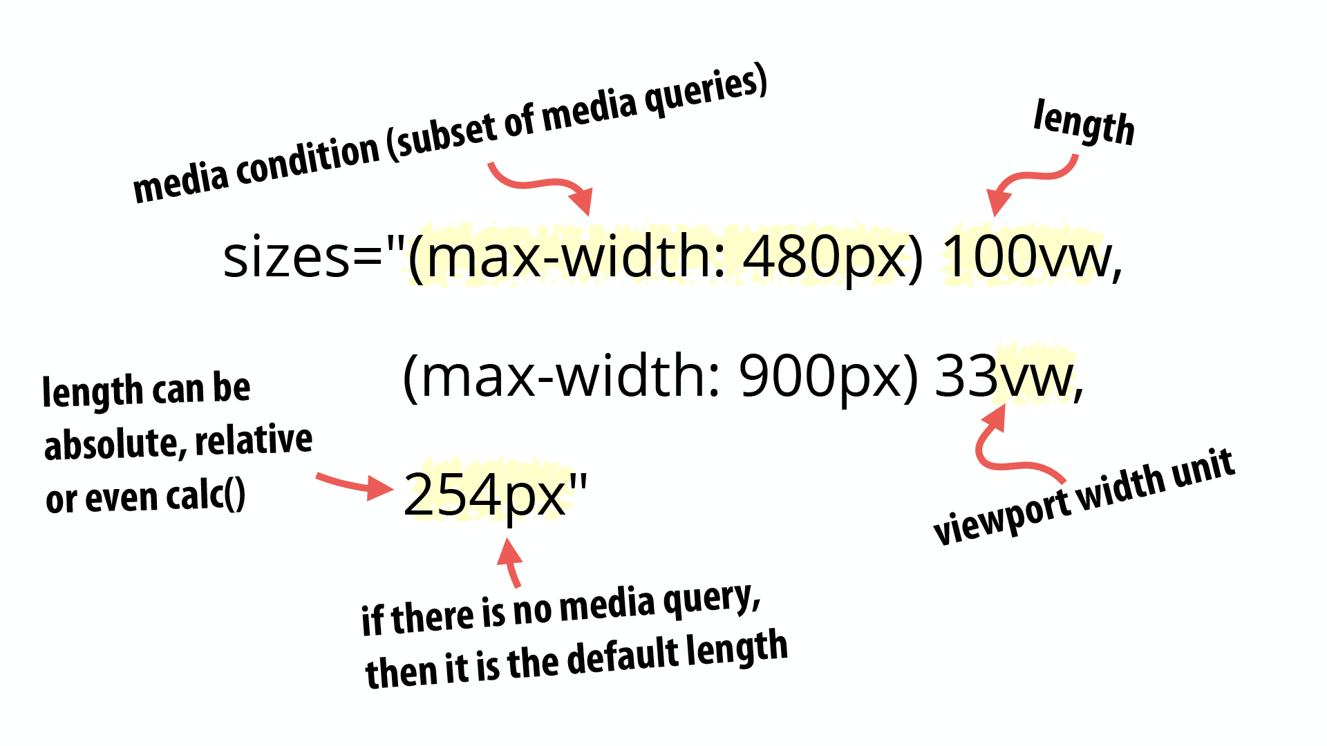
sizes="(max-width: 480px) 100vw, (max-width: 900px) 33vw, 254px">
Code language: HTML, XML (xml)Like srcset, each comma-separated item contains two values separated by a space.
Media conditions
The first value is a media condition. A media condition is similar to a media query, but not as full featured. For example, you can’t do things like ‘@media screen’, but you can do everything else you would likely want to do in sizes.
Most commonly, your media condition is going to be a something like ‘(max-width: 480px)’ or maybe ‘(min-width: 480px)’.
Lengths
The second value in each comma-separated item is a length. This length is often expressed using the viewport width (vw) unit.
There’s a good chance you haven’t seen vw units before. They are fairly new, but have wide support in current browsers.
Each vw unit represents 1% of the viewport width, which is a fancy way of saying that 100vw is 100% of the viewport width and 33vw is 33% of the viewport width.
The length doesn’t have to be expressed as a viewport width unit. It can be any length including absolute and relative length. You can even use CSS calc() to do things like auto-calculate margins dynamically.
How does the browser select the correct sizes value?
When the browser starts through the comma-separated list of values, it grabs the first value where the media condition passes.
Take another look at our sample markup and the order in the sizes attribute:
<img src="cat.jpg" alt="cat"
  srcset="cat-160.jpg 160w, cat-320.jpg 320w, cat-640.jpg 640w, cat-1280.jpg 1280w"
  sizes="(max-width: 480px) 100vw, (max-width: 900px) 33vw, 254px">
Code language: HTML, XML (xml)
If we translated this into a bulleted list of instructions, it might look like this:
- (max-width: 480px) 100vw — If the viewport is 480 pixels wide or smaller, the image will be 100% of the viewport width.
- (max-width: 900px) 33vw — If the viewport is 480 pixels wide or smaller, this rule will never be reached because of the previous media condition. Ergo, if this rule effectively says that if the viewport is 481 pixels wide to 900px, that the image will be 33% of the viewport width.
-
254px — When there is no media condition listed, the length is assumed to be a default value used when none of the other media conditions are met. In this case, we have media conditions covering viewports up to 900 pixels. Therefore, from 901 pixels wide to infinity, the image will be 254 pixels wide.
To help you visualize how this might work in the real world, I created a little video that looks as how the values might change as the viewport width increased on the Walmart Grocery site.
NOTE: As of the time of publication, the Walmart Grocery site was not using srcset and sizes. This is hypothetical markup. If you want to see srcset and sizes in action, take a look at The Guardian which recently switched to using srcset and sizes.
But what about separation of content and presentation?
I’ve seen many complaints about the new responsive images specification. Most amount to either complaints about complexity that ignore the fact that images on the web are inherently complex3 or some variation of WWIC.
But the one complaint I have a tremendous amount of sympathy for is the idea that we now have presentation information—the size of the image—in the markup. I doubt there was anyone involved in the responsive images standards process who didn’t share this concern at some point.
Unfortunately, it is unavoidable. As discussed in Part 4, the browser starts downloading image sources before the size of the image in the page is known.
The only way to support the pre-loader and make sure the right source gets downloaded is to provide some information about the size of the image in the markup.
Is the pre-loader worth it?
If you’re like me, you may have found yourself wondering whether the pre-loader was worth all of the problems it causes?
Yes. Yes, it is.
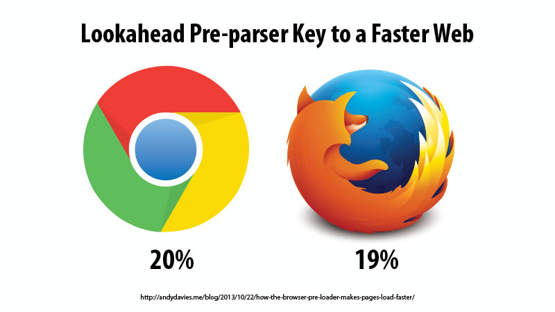
Andy Davies wrote about how Google saw a 20% and Firefox a 19% increase in average page speed after implementing the pre-loader. Steve Souders thinks that “preloading is the single biggest performance improvement browsers have ever made.”
We can’t simply throw out that web performance boon in favor of responsive images.
Therefore, we have to find a compromise. The sizes attribute is that compromise. It provides just enough information for the browser to do its job.
Srcset and sizes = Smart browsers
Srcset and sizes provide all of the functionality you need for the resolution switching use case. They give the browser just enough information to allow it to make smart decisions.

But what happens when you need more control? What about art direction?
Next Tuesday, Responsive Images 101, Part 6: The Picture Element.
Responsive Images 101 Series
Footnotes
- How quickly we forget web-safe colors, Lynda Weinman‘s multiple books on web graphics, and the way different images formats compress. And it’s not getting any simpler. Images on the web are inherently complex.
- Super hero by Ashley Rose. Dog Intelligence by Alice Jamieson. Licensed under Creative Commons.
Jason Grigsby is one of the co-founders of Cloud Four, Mobile Portland and Responsive Field Day. He is the author of Progressive Web Apps from A Book Apart. Follow him at @grigs.


