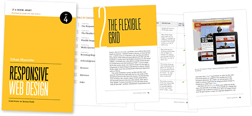
Responsive Web Design Book Review
Ethan Marcotte’s new book on Responsive Web Design is both not what I had hoped for and more than I had dared to imagine.
First, let’s get my disappointment out of the way.
As I explained in a previous post, I’m struggling with a chapter on Mobile First Responsive Web Design for our upcoming book. I had secretly hoped that Ethan’s book would contain a never-seen-before blueprint on how to tackle Mobile First Responsive Web Design.
Alas, it doesn’t contain a secret decoder ring. And if I’m honest with myself, I knew it wouldn’t.
Ethan and I have talked multiple times about how much thought and work is going into the Boston Globe project. Responsive Web Design, particularly the mobile first variety, is still very young.
So it was unfair of me to expect Ethan’s book to magically make the tough stuff we’re all working on solving suddenly go away. It’s a testament to Ethan that I even thought he might be able to pull it off.
What the book did do is something I hadn’t dared to imagine: the book transcends the topic it covers.
I don’t know how else to describe it. From the first two paragraphs, Ethan paints a picture of how the world we’re living in is changing:
As i begin writing this book, I realize I can’t guarantee you’ll read these words on a printed page, holding a tiny paperback in your hands. Maybe you’re sitting at your desk with an electronic copy of the book up on your screen. Perhaps you’re on your morning commute, tapping through pages on your phone, or swiping along on a tablet. Or maybe you don’t even see these words as I do: maybe your computer is simply reading this book aloud.
Ultimately, I know so little about you. I don’t know how you’re reading this. I can’t.
With these words he sets a tone that continues throughout the book. A tone that is both reassuring and at the same time inspiring.
Now don’t get me wrong, it isn’t all inspiration and theory. Ethan does a great job of diving into how to build Responsive Web Designs. He walks you through the process, letting you see where you will run into problems, and providing suggestions for solutions.

He anticipates problems that I wouldn’t have thought to include. For example, the fact that flexible images develop artifacts on Internet Explorer 7 and below.
At first, this IE artifact bug seems like a divergence from the main topic, but I quickly came to appreciate the fact that when someone completes this short book, that they will have all the tools they need to start building Responsive Web Designs.
Ethan ties the two threads—the inspiring view of the where the web is headed and the technical details of Responsive Web Design—together In the final chapter entitled “Becoming Responsive” where he covers mobile context, picking breakpoints, and responsive workflows.
It is in this chapter that you realize what he’s truly accomplished. He’s written a book ostensibly about making the web respond to its environment, but what he’s really done is transform you into a more responsive being.
Ethan Marcotte’s new book, Responsive Web Design, went on sale today. Needless to say, I highly recommend it.

Jason Grigsby is one of the co-founders of Cloud Four, Mobile Portland and Responsive Field Day. He is the author of Progressive Web Apps from A Book Apart. Follow him at @grigs.