So, about that logo…

Back in the heady days of the .com boom when my cofounders and I all worked at Kavi Corporation, we had a number of technical standards-setting organizations as clients. As proof of industry support for their standards, almost all of these SSOs would have a page on their site that displayed the logos of their member companies. It was up to me and the other designers at Kavi to make sure these rosters looked good; the images were compressed properly, free of float clearing issues and with equal visual weight given to each logo, especially those at the board level.
Over time, I became something of a tech company logo connoisseur and developed an awareness of what made for an effective logo. Aside from the basics taught at design schools everywhere, I found that a width to height ratio between 2:1 and 3:1 was a de facto standard, and that straying too far from this aspect ratio range meant that the logo wouldn’t read well when sized to match the others.
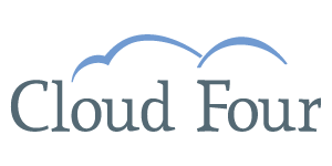
I kept this “early aughts tech company logo” aspect ratio in mind when designing Cloud Four’s original logo. Also, we wanted a logo that conveyed the intangible qualities of our fledgling agency: openness, transparency and reliability. Nothing says, “Hire us, we’re almost certainly going to be around six months from now!” quite like a serif typeface, so we selected Lineare, whose graceful ascenders ably supported our brand qualities.
A color palette of muted blues and grays reflected our home, Portland, enshrouded in a gentle drizzle 8 months of the year. The cloud shapes above the letter forms were an obvious tie-in to our company name and added a sense of rise, growth and lift to the text treatment. It is probably no small coincidence that I was pregnant at the time of the original logo’s creation either!
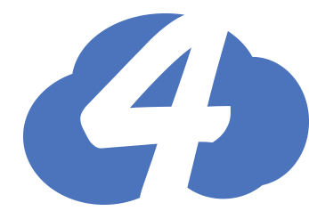 One or two things have changed since 2007. For one, that 3:1 aspect ratio doesn’t work too well for the abundance of square formats to which a modern logo must conform, such as home screen icons and Facebook profile images.
So, our new logo was born out of necessity, quietly appearing first as a favicon, then migrating to our Twitter account and beyond. We’ve also evolved as a company; gaining confidence and expertise with each employee who joins our team. While we’re still an open, transparent and reliable company, we’re also a cheerful, responsive and scarily smart company.
Our new logo reads well in sizes ranging from Slack emoji to the t-shirts we wore at Responsive Field Day. The vivid blue is more eye-catching than the demure slate of yesteryear. The cheerful, bubbly cloud shape contrasts with the strong diagonals of the negative space of the “4” that impart a sense of motion and activity to the logo form. I envision our new logo emblazoned as a badge on the arm of a scout, exploring the wilds of the web’s frontier.
Aileen Jeffries is a designer and Cloud Four co-founder.