Design Happens Between Breakpoints

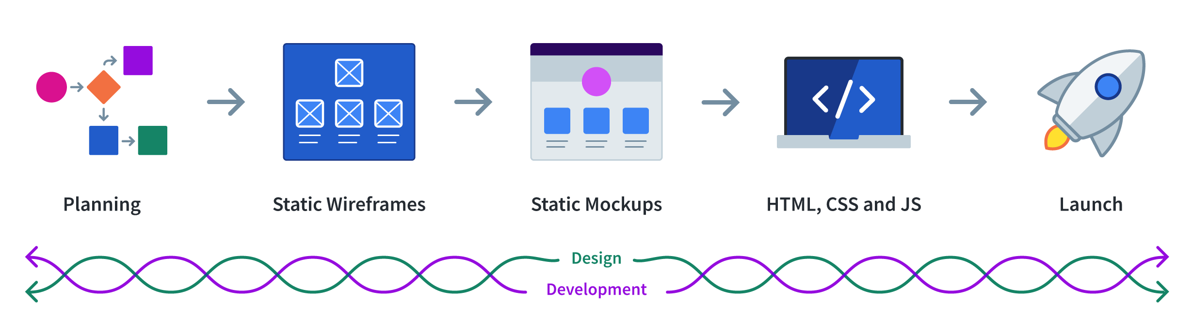
In a traditional web design process, designers create static mockups as their final deliverable. Designers hand the mockups over to developers who are tasked with converting them into HTML, CSS, and JavaScript.
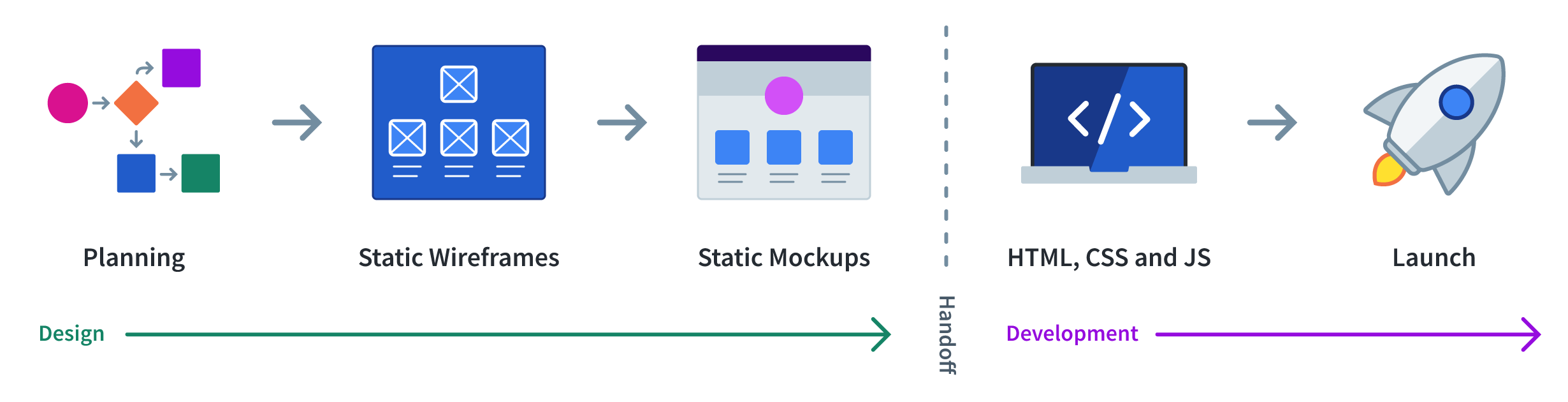
The traditional web design process hopes that these static mockups—often representing mobile, tablet, and desktop breakpoints—provide developers with everything they need to know to turn the designs into functional web pages. In reality, design happens between breakpoints.
A Real World Example
We recently helped Cloudinary upgrade their blog. Cloudinary’s designers provided static mockups that we converted into responsive web templates. During development, my colleague Paul Hebert noticed a section displaying top categories looked awkward at a screen size in between the breakpoints that we had been given mockups for.

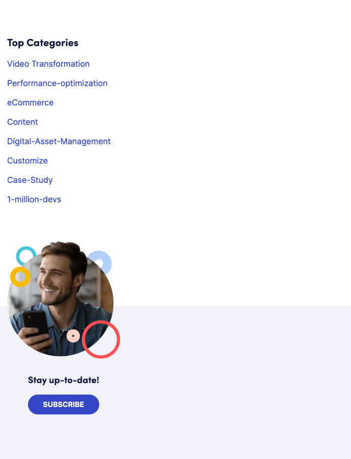
Paul suggested that at this viewport width, it might work better if the two sections were side-by-side:
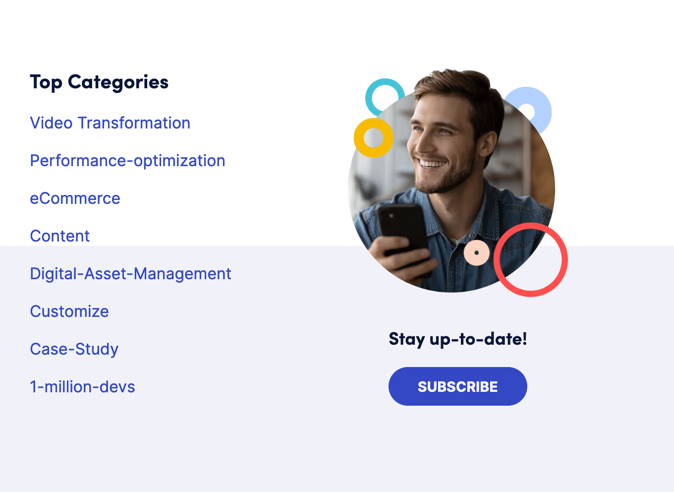
Unfortunately, putting the content into two columns caused a new design issue—the background color was cutting into the middle of the top categories list.
So Paul suggested that for this viewport size, it might make sense to keep a solid background behind the two columns:

Our stakeholders at Cloudinary appreciated that Paul had identified a design problem and approved of his suggested changes. Because of the positive outcome, you might be tempted to consider this a success for the traditional web design process.
But here’s the rub. Paul is unique. He is equally adept at both design and development. He can easily diagnosis and fix design issues.
What happens when your static mockups are in the hands of a developer who doesn’t have Paul’s design skills?
The Best Responsive Design Advice
Paul’s design skills aren’t solely responsible for identifying the problems. Paul was also following the simplest and best responsive design advice I’ve ever heard.
At the Breaking Development Conference in 2012, Stephen Hay described his process of picking breakpoints. He said that he started from the smallest screen and expanded his browser until the page looked like crap, and then BOOM, you need a breakpoint.
Too often we see designers fixate on established breakpoints. Someone at one time decided on a set of breakpoints and from then on, all design changes happen at those viewport widths. It is a breakpoint dogma that Tyler Sticka wrote about a couple years ago. Design problems don’t only show up at the preordained breakpoints.
At Cloud Four, everyone—designer, developer, project manager, it doesn’t matter—is constantly resizing their browsers to make sure experiences continue to work across all viewport sizes. After Paul finished implementing the suggested changes, he shared a video of him resizing his browser to make sure the new behavior worked for everyone.
How do you resize a static mockup?
You can’t. That’s the problem. It’s one of the reasons why breakdowns happen when static mockups are handed off to developers. These mockups leave many design decisions undefined and in the hands of developers who aren’t trained designers.
So how can designers who create static mockups design between the breakpoints? The answer isn’t creating more mockups. They are already creating too many artifacts without trying to create more to address the gaps.
In the short run for those using a traditional web design processFootnote 1 , we need to recognize that design doesn’t stop when something is handed off to developers. It continues until launch so designers can be involved in how the design is implemented in code.
And in the same vein, there are development decisions happening before handoff. Developers should be involved throughout as well.
In the long term, we need design tools to dramatically change. They need to support truly responsive designs—dynamic mockups that can be resized so designers can follow Stephen Hay’s advice, figure out where their mockup looks like crap, and add breakpoints.
Unfortunately, most design tools have drawn the wrong conclusions from the challenges they see designers facing in the traditional web design process. More on that next time.
This article is part 2 of a series on design tools in a design system world:
- Traditional Web Design Process is Fundamentally Broken
- Currently Viewing:Design Happens Between Breakpoints
- Faulty Assumptions and Unwanted Features of Most Web Design Tools
- Responsive Design Process that Works
- Web Design Tool Wish List
- [Coming soon]
Footnotes
- Or you could replace the traditional web design process with a process that incorporates in-browser mockups, but not every organization and designer can make that change. But if you’re interested in a process like that, stay tuned or… um… hire us. Return to the text before footnote 1
Jason Grigsby is one of the co-founders of Cloud Four, Mobile Portland and Responsive Field Day. He is the author of Progressive Web Apps from A Book Apart. Follow him at @grigs.

