
How Apple.com will serve retina images to new iPads

By Jason Grigsby

Published on March 13th, 2012

Topics

One of the more interesting questions raised by the new iPad and its retina display is whether or not web sites should deliver higher resolution images when there is no way to know the connection speed. AppleInsider found that Apple.com is being prepped to deliver high-res images and documented how you can test it in Safari on your desktop.

As you can imagine given my research on responsive images, I was keenly interested to see what approach Apple took.

What they’ve chose to do is load the regular images for the site and then if the device requesting the page is a new iPad with the retina display, they use javascript to replace the image with a high-res version of it.

The heavy lifting for the image replacement is being done by image_replacer.js. Jim Newberry prettified the code and placed it in a gist for easier reading.

The code works similarly to responsive images in that data attributes are added to the markup to indicate what images should be replaced with high-res versions:

<article id="billboard" class="selfclear" data-hires="true">
  <a id="hero" class="block" href="/ipad/">
    <hgroup>
      <h1>
        <img src="http://images.apple.com/home/images/ipad_title.png" alt="Resolutionary" width="471" height="93" class="center" />
      </h1>
      <h2>
        <img src="http://images.apple.com/home/images/ipad_subtitle.png" alt="The new iPad." width="471" height="54" class="center" />
      </h2>
     </hgroup>
     <img src="http://images.apple.com/home/images/ipad_hero.jpg" alt="" width="1454" height="605" class="hero-image" /> 
  </a>
</article>
Code language: HTML, XML (xml)

Unlike most of the solutions I reviewed last summer, Apple is applying the data-hires attribute to the parent container instead of to the images to themselves. Also, the images borrow from native iOS development and have consistent sizes. So the high-res version of ‘ipad_title.png’ can be found at ‘ipad_title_2x.png’.

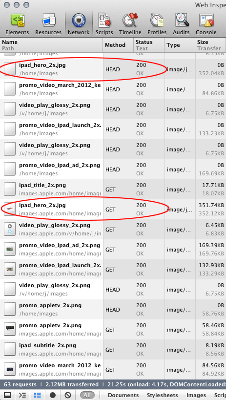
As far as I can tell, there is no attempt to prevent duplicate downloads of images. New iPad users are going to download both a full desktop size image and a retina version as well.

The price for both images is fairly steep. For example, the iPad hero image on the home page is 110.71K at standard resolution. The retina version is 351.74K. The new iPad will download both for a payload of 462.45K for the hero image alone.

The total size of the page goes from 502.90K to 2.13MB when the retina versions of images are downloaded.

Another interesting part of image_replacer.js is that it checks for the existence of 2x images before downloading them:

    requestHeaders: function (c) {
        var a = this;
        if (typeof a._headers === "undefined") {
            var b = new XMLHttpRequest();
            var a = this;
            src = this.hiResSrc().replace(/^http://.*.apple.com//, "/");
            b.open("HEAD", src, true);
            b.onreadystatechange = function () {
                if (b.readyState == 4) {
                    if (b.status === 200) {
                        a._exists = true;
                        var f = b.getAllResponseHeaders();
                        a._headers = {
                            src: src
                        };
                        var d, e;
                        f = f.split("r");
                        for (d = 0;
                        d < f.length; d++) {
                            e = f[d].split(": ");
                            if (e.length > 1) {
                                a._headers[e[0].replace("n", "")] = e[1]
                            }
                        }
                    } else {
                        a._exists = false;
                        a._headers = null
                    }
                    if (typeof c === "function") {
                        c(a._headers, a)
                    }
                }
            };
            b.send(null)
        } else {
            c(a._headers, a)
        }
    },

This is probably necessary as they move to providing two sets of assets in case someone forgets to provide the retina image. It prevents broken images. Unfortunately, it means that there are now three http requests for each assets: a GET request for the standard image, a HEAD request to verify the existence of the retina image, and a GET request to retrieve the retina image.

Web Inspector timeline showing additional HEAD request for 2x image

Another interesting bit of image_replacer.js is when they decide to go retrieve the double-size image:

if ((this.options.debug !== true) && ((typeof AC.Detector !== "undefined" && AC.Detector.isMobile()) || (AC.ImageReplacer.devicePixelRatio() <= 1))) {

Of particular interest is the test for AC.Detector.isMobile(). This is defined in a separate script called browserdetect.js (prettified gist version).

The browserdetect.js is full of user agent string parsing looking for things like operating systems and even versions of OS X. The isMobile() function does the following:

isMobile: function (c) {
  var d = c || this.getAgent();
  return this.isWebKit(d) && (d.match(/Mobile/i) && !this.isiPad(d))
},

Basically, is this a WebKit browser, does the user agent mention mobile, and let’s make sure it isn’t an iPad. Browsers not using WebKit need not apply.

AppleInsider’s instructions on how to test the retina version of Apple.com on your computer are very easy. Open Apple.com in Safari. Go to the console in the Web Inspector and type the following:

AC.ImageReplacer._devicePixelRatio = 2
new AC.ImageReplacer()

You’ll get back a klass object as shown below.

Console screenshot

As an aside, notice SVG references in the console screenshot.

Probably not a whole lot for a typical site because our goals will be different than Apple’s.

For Apple, it probably makes more sense to show off how wonderful the screen is regardless of the extra time and bandwidth required to deliver the high-resolution version. For everyone else, the balance between performance and resolution will be more pressing.

There are a few minor things that we can take away though:

  • Planning ahead and knowing that you can depend on high-res images being available would be preferable to making extra HEAD requests to check to see if the images exist.
  • Setting priority on which images to replace first is a good idea. This is something to look at and borrow from image_replacer.js.
  • The retina version of Apple.com’s home page is four times the standard home page. Delivering retina images should be considered carefully.

Perhaps most importantly, Apple isn’t sitting on some secret technique to make retina images work well. Maybe they will provide better solutions in iOS 6. The way they handle images—downloading both sizes plus an additional HEAD request—may be the least efficient way to support retina displays. But for Apple, it likely doesn’t matter as much as it will for your site.

Hat tip to Jen Matson for pointing me to the original AppleInsider article.

Comments

Fernando said:

It’s not because of a new Apple device that this will become a common routine, but we all know that in a somewhat near future desktop and laptop screens will be replaced with high-dpi screen such as the iPad’s and larger images will be required to show the same level of detail and sharpness. This will not happen _too_ soon though.

George Hammerton said:

This is great! I was wondering how best to handle the new site on iPad. I tried it in the iOS Simulator the other day and the design looked all pixel-ey… *shudder*

Can’t wait to update the site for retina iPad, thanks! 😀

room34 said:

I am planning to move to using mostly/solely high-res images, at least for things like logos, but I will not be providing a fallback (except in some cases for IE <= 8). High-res only, let the browser scale it.

It's not a perfect solution, but I think it's at least as good as Apple's, and it's not overthinking it.

joey said:

@room34 : so any device with any connexion will download big images using 4 times more bandwith and RAM then will need to scale them down for the vast majority of your users ?
they will apreciate for sure.
and you too will need 4 times more bandwidth (server-side), 4 time more disk space and your disk cache will handle 1/4th of what it did before. not a problem if you don’t have too many users.

karl said:

“Planning ahead and knowing that you can depend on high-res images being available would be preferable to making extra HEAD requests to check to see if the images exist.”

OR as they already rely on JS and download the first version they could just use transparent content negociation http://my.opera.com/karlcow/blog/2011/12/08/responsive-images-and-transparent-content-negotiation-in-http

Send Alternates: with the first request and download the appropriate second one if needed.

OR if they want to download once. use the HEAD first, look for Alternates HTTP header and GET the one which is appropriate for their own use.

karl said:

@Jason What Apple is doing is a kind of JS proprietary shiv. Basically there is no spec for responsive img and they implement a mechanism which is not that effective. What I propose is to improve a little bit what they are doing.

1. Serve the page with img src=”/verylowresfoo” and the JS shiv (so the people with no JS will receive an img)
2. GET /verylowresfoo HTTP/1.1 send along the “Alternates:” URI.
3. the shiv makes the request for the appropriate one using the “Alternates:”.

So indeed the browser could be modified, but it is not mandatory. It’s basically a similar option than the ones used by Apple but with a request less. 2 HTTP GET (instead of 3)+2 downloads.

In the case where you would not care at all for JSless user agents, you could have HEAD+GET, it makes 2 HTTP req + 1 download.

Brendan Falkowski said:

This technique is very similar to what Josh Emerson proposed at Responsive Summit a month ago. The JS is on GitHub: https://github.com/joshje/Responsive-Enhance

It’s worth mentioning the *perceived* speed isn’t +4x. The browser downloads inline images first, then after the page load JS sweeps through requesting the hi-res images and replacing them.

If replacement occurs before the user scrolls to the updated content the process is invisible, and not really slower than the lo-res load.

Jeremy Keith has a good outline of the approach here: http://adactio.com/journal/5208/

Adams Immersive said:

Very interesting—thanks for the details and testing procedure. I think I’ll use _2x for things like logos, maps, diagrams and hard art, and only rarely for photos and elements that look OK soft. Replacing just a couple key images (logo, background texture) on my upcoming site has only added about 30-40k, but it’s a great effect. A low-res logo really is noticeable with retina-sharp text it. I’ve felt than even when simply pinch-zooming on an older iPad. But now it’s important even at default zoom.

uxmatthew said:

@lukew

My guess would be because they just didn’t have the assets for it.

It seems logical that they would use ‘nohighres’ as a flag that no high res image was available.

The larger the image is, the more likely a super high res version was thrown out before they knew they would be doing this.

Jason Grigsby (Article Author ) said:

@lukew A few things are different about images with nohires in the file names.

First, two of them are background images, not img tags like the other assets that are being controlled by image_replacer.js. I’ve reviewed the CSS and I don’t see any rules that replace the images with high res versions using a pixel density rule.

But what I do see is a bunch of logic in http://images.apple.com/v/ipad/a/scripts/features.js that reference these images. A prettified gist of that file can be found here:
https://gist.github.com/2039654

AC.TrackBackground is being applied to the background images. A gallery is being applied to the imgs within the page (e.g., airplay_bg_nohires.jpg).

My guess is that the additional functionality for these images either made it harder or possibly conflicted with the image replacement techniques.

LukeW said:

@Jason interesting though that some of these images are the lead/top pictures and are not getting the 2x treatment. Cause as you say I did not see the CSS pixel density rule anywhere.

Jason Grigsby (Article Author ) said:

@lukew the whole page does something as you scroll. I didn’t notice it in Chrome, but in Safari it is obvious. Even the header image moves.

I’m still going with the simplest explanation which is that this is the most complex page because of all of the animation on it and that it will take longer to swap the images and make sure they work as expected.

Janne Savukoski said:

If the decision logic is (or can be) based solely on data that will be in the request headers, why don’t you just configure the httpd to serve different assets? With appropriate vary-headers to be cache-friendly.

This is such an obvious solution, though, that there must be some fallacy I didn’t think of…

Ian said:

This is bullshit, using javascript to load the images is ridiculous, even if you detect the type of image before anything has loaded you are still requesting both images. Imagine that on a 3G connection.

Avi is correct it should be built into the img tag, the same way lowsrc was used for slower connections.

There is an existing technology ALREADY designed for this called media queries, whoever is doing the heavy lifting here is specifically targeting iPads and shoud not be looking to this as a foolproof method of serving up retina images for the web.

See here for a better solution. http://blog.iwalt.com/2010/06/targeting-the-iphone-4-retina-display-with-css3-media-queries.html

Jason Grigsby (Article Author ) said:

@Avi Yes, that’s what the responsive images community is working on:
http://www.w3.org/community/respimg/

@Janne there is nothing in the request headers that can tell you what the resolution of the device will be. 🙁

@ian Yes, mediaqueries will help with CSS images. Some of these images could have been better handles as CSS. Or font-face declarations. Some are actual content that should be treated in the content of the page as an img tag. For images that should use the img tag, there are no great solutions:
http://cloudfour.com/responsive-imgs-part-2/

Tyler Craft said:

I’m not a fan of the -2x logic. It forces your system into a file structure that may not always work (WordPress off the top of my head for one). Although I am glad to see them using ‘data-‘ attributes per HTML5.

I like this script (disclosure, i wrote it), as it can do the -2x, but also supports data-retina attribute on the image tag itself (although perhaps I should have used data-hires…). Similar to Apple it can use AJAX to check the HEAD if the file exists or not:
https://github.com/tylercraft/jQuery-Retina

I’d love to see more research done in this area, as you mention in the first sentence – there is no detection of connection speed. And that is the next main issue… imo

Hamranhansenhansen said:

People used to argue that thumbnail images were sending the image twice and were therefore inefficient. I-T guys are lousy Web developers.

I would argue that if the Web wants to survive, it needs to improve in quality exponentially for a few years to make up for the XHTML fiasco and the lack of rendering quality outside of Safari. That is not going to be accomplished by following Web development dogma which mostly sucks. We need to stop being so careful and make something that doesn’t look like shit for a change.

Howard M said:

I don’t get it – I read recently that all you have to do is use double-sized PROGRESSIVE jpegs, then have the browser resize them back down using the width and height tags.

Simple – only one image needs to be delivered, and it shows up cleanly on retina and non-retina displays. I did a quick test – my logo at the top of push-pictures.com/recent is now a double sized jpeg, but it shows up perfectly sharp on all displays. Super-sharp on my iPad 3.

Psydeshow said:

Um, the web has always looked like shit, where have you been? Its success is based, in a large part, on the fact that you can just build it without necessarily making it look nice first.

Obviously, if you want to reach the hearts and minds of Apple owners, then you hire a whiz-bang design firm and scale up your images. If not, don’t sweat it.

Eventually the Apple owners will move into a walled-garden AOL-style web where everything is shiny, and the rest of us can get on with making efficient, useful sites.

Jason Grigsby (Article Author ) said:

Thanks everyone coming from DaringFireball. We were planning on moving to a new server on Monday with more capacity. Of course Gruber linked to us the day before the move. The server seemed to hold up pretty well. Thanks for taking the time to read and comment.

@Paul We absolutely need some way to take into consideration network speed and limited data plans. My suspicion is that we’ll need the browser to be smarter about that because network speed are transient.

@Tyler thanks for the pointer to your script. I’ll take a closer look.

@Jeremy your solution is better in my opinion than what Apple did, but it may still suffer from race conditions from lookahead preparing behavior. See http://cloudfour.com/responsive-imgs-part-2/#preventdownload and http://blog.yoav.ws/2011/09/Preloaders-cookies-and-race-conditions

@LeRou There’s been a fair amount of discussion about moving to something like JPEG2000–which has progressive downloads–but it only solves one of the use cases for responsive images. It doesn’t solve cases where you want to change the cropping of an image based on size. Also, it will take longer and won’t be backwards compatible. I captured some of the challenges that the img tag much accommodate here http://cloudfour.com/responsive-imgs-part-3-future-of-the-img-tag/

@Howard Delivering retina-sized images for all devices regardless of whether or not the device supports high-density images means slowing down everyone’s browsing experience unnecessarily.

@Psydeshow High-density displays are moving into computing devices throughout the industry. This isn’t an Apple specific issue. It is also consistent with the challenges of responsive web design.

@ALL if you’re interested in these topics, I recommend checking out the W3C Responsive Images Community Group where we’re discussing and working on potential solutions http://www.w3.org/community/respimg/

markku said:

The use of “nohighres” on larger images could also be due to their web developers trusting Safari/Webkit on the new iPad to scale those relatively large images acceptably well to 2x the size. Scaling a photo 700 pixels wide to something twice that will look more acceptable than scaling a 40 pixel wide photo to 80 px width.

Tomis said:

Why the hell are they doing this all client-side? This should all be handled server-side. Put the image requests behind a script (PHP or whatever they like), same user agent check, then serve the high-res ones to the iPad, normal to everyone else.

No multiple requests, less bandwidth.

I hope doing this all client-side is just a stop-gap on their part until they get the backend modified.

Maynard Handley said:

@joey at comment 6

HiDPI displays are coming for everyone. Maybe not this year, maybe not next year, but over the next five years. Given that, we might all do well to spend less time worrying about the transition and more time worrying about how to do the future correctly.
In particular, as the DPI of an image increases, more and more of what you are displaying is “noise” — but noise that is perceived as texture and that you don’t simply want to remove from your image. It would be sad if, ten years from now, we’re all still serving up JPGs run at minimum compression because the community can’t get its act together to use something better.

The most obvious immediate part of the solution would be much larger use of JPEG2000 which has some very useful features in this context
(a)
The same (single) image can be chopped at various points in the bitstream to serve up images of varying fidelity. Ideally a protocol would exist whereby, in the SINGLE request made by a client for an image is embedded a resolution marker (just a few bits, perhaps two or three). Based on that, the server would know where to truncate the served JPEG2000 bitstream.
(b)
JPEG2000 also becomes rather more efficient than JPEG as what you are compressing approaches closer to noise (with non-random statistics) rather than the specific sorts of features (edges and ramps and suchlike) for which JPEG is optimized.

Beyond this, one could imagine a superior image compression spec that, rather than attempting to preserve noise something like pixel for pixel, rather detects the “essence” of the visual texture and encodes a description of that. Something like this is already done in audio compression — it is part of the AAC spec — and I am guessing (based on work like it I’ve seen in the context of video) that it has been examined, at least in academia, for still image compression.

The larger point is that it is a bit rich for the community to whine about the cost of 2×2 resolution images while that same community sits around absolutely uninterested in utilizing more efficient image compression technology.

Replies to Maynard Handley

that guy replied:

The reason JPEG 2000 never took off is that its computation complexity was much higher, and the gains were modest with most real-world content (and sometimes debatable–its artifacts had a different look than JPEG’s).

Regarding visual texture, JPEG already does an extremely good job of recognizing visual noise and compressing the heck out of it. That is one of the things it does best. If anything, JPEG shows its ugly side more on extremely clean, not-noisy images.

JPEG 2000 may be a good fit for progressive display (where you could truncate the stream early for non-retina devices), but JPEG 1 also has a progressive mode which could do largely the same thing. I don’t think JPEG 2000 actually offers much more in this regard.

Allan White said:

@Tomis, @Jason: Re: server-side images – good point, hardware models aren’t detected. However, I think he’s on to something with server-side delivery. Is there a way to, like media queries, detect the viewport width and pass that back to the server? Something like Modernizr that can talk to PHP? Because if a cookie or var could be set, that could really cut down on the hacks and HTTP requests.

I’ve been using this hybrid approach (server-side mobile images) for other problems, I wonder if that could be extended.

Steph said:

I’m a non-tech person who uses WordPress for my website/blog I’m constantly creating, and I don’t want my site to look like garbage to new Apple users. I typically upload lower resolution pictures so as not to bog down speed.

So, in basic terms, what is it that you suggest a content provider to do for images, logos?