Responsive Images 101, Part 9: Image Breakpoints

I’ve dreaded writing this installment of the Responsive Images 101 series. Selecting image breakpoints is something everyone will face, and frankly, I have no good answers for you.
But sooner or later, we will all face the image breakpoints koan. We might as well start now.
What are responsive image breakpoints?
In our responsive layouts, breakpoints refer to the viewport sizes at which we make changes to the layout or functionality of a page. These typically map to media queries.
Responsive image breakpoints are similar, but slightly different. When I think about image breakpoints, I’m trying to answer two questions:
- How many image sources do I need to provide to cover the continuum of sizes that this image will be used for?
- Where and when should the various image sources be used?
The answers to these questions lead to different breakpoints than the criteria we use to select breakpoints for our responsive layouts. For our layouts, we follow Stephen Hay’s advanced methodology: We resize the browser until the page looks bad and then BOOOOM, we need a breakpoint.
With the exception of art direction, the main reason why we need multiple image sources has nothing to do with where the images look bad. We want to provide multiple image sources because of performance concerns, different screen densities, etc.
So we can’t simply reuse our responsive layout breakpoints for our images. Or I guess we can, but if we do so, we’re not really addressing the fundamental reasons why we wanted responsive images in the first place.
Image breakpoints for art direction is relatively easy
In situations where the image falls under the art direction use case, the art direction itself will often tell us how many image sources we need and when they should be used.
If you think back to the Nokia browser site example, we can tell when the image switches from landscape to portrait mode. When that switch occurs, we know we’re going to need a new source image.
However, this may only be part of the picture. What if one of the art directed images covers a large range of sizes. We may find that we still need to have multiple sources that don’t map to the art direction switch.
You can see an example of this in the Shopify homepage that we looked at in Part 8.

Despite the fact that the image only has one major art direction change—from the full image to the cropped one—Shopify still provided six image sources to account for file size and display density.
<picture>
  <source srcset="homepage-person@desktop.png, homepage-person@desktop-2x.png 2x"
          media="(min-width: 990px)">
  <source srcset="homepage-person@tablet.png, homepage-person@tablet-2x.png 2x"
          media="(min-width: 750px)">
  <img srcset="homepage-person@mobile.png, homepage-person@mobile-2x.png 2x"
       alt="Shopify Merchant, Corrine Anestopoulos">
</picture>
Code language: HTML, XML (xml)
So knowing that an image falls under the art direction use case can give us some clues, but it doesn’t answer all of our questions about the necessary image breakpoints.
What about resolution switching breakpoints
This is where things really get tricky. At least art direction provides us with some hints about how many image sources might be needed.
So long as we’re downscaling flexible images, they will always look good. We can’t rely on them looking bad to tell us when we need to change image sources.
Let’s take a look at a resolution switching example:
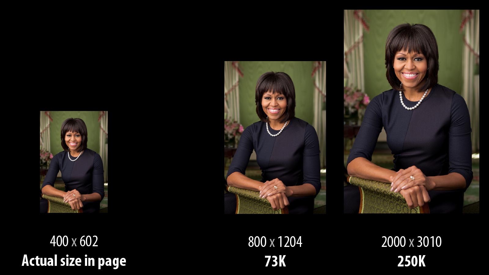
In this example, we have a photo of Michelle Obama where the image in the page is 400 x 602 pixels for the current viewport size. The largest size that the image is ever displayed at is 2000 x 3010 pixels. That large file is 250K.
We can simply shrink that 2000-pixel image, and it will look good. But it would be unnecessarily large. It would be better if we provided a smaller version like the one 800 x 1204 resolution image that is shown in the example. That image is only 73K.
We can all agree that when the image in the page is only 400 x 602 pixels in size, that providing an image that is 800×1204 and 73K is better than having people download the largest version of the image.
But why stop at 800×1204?
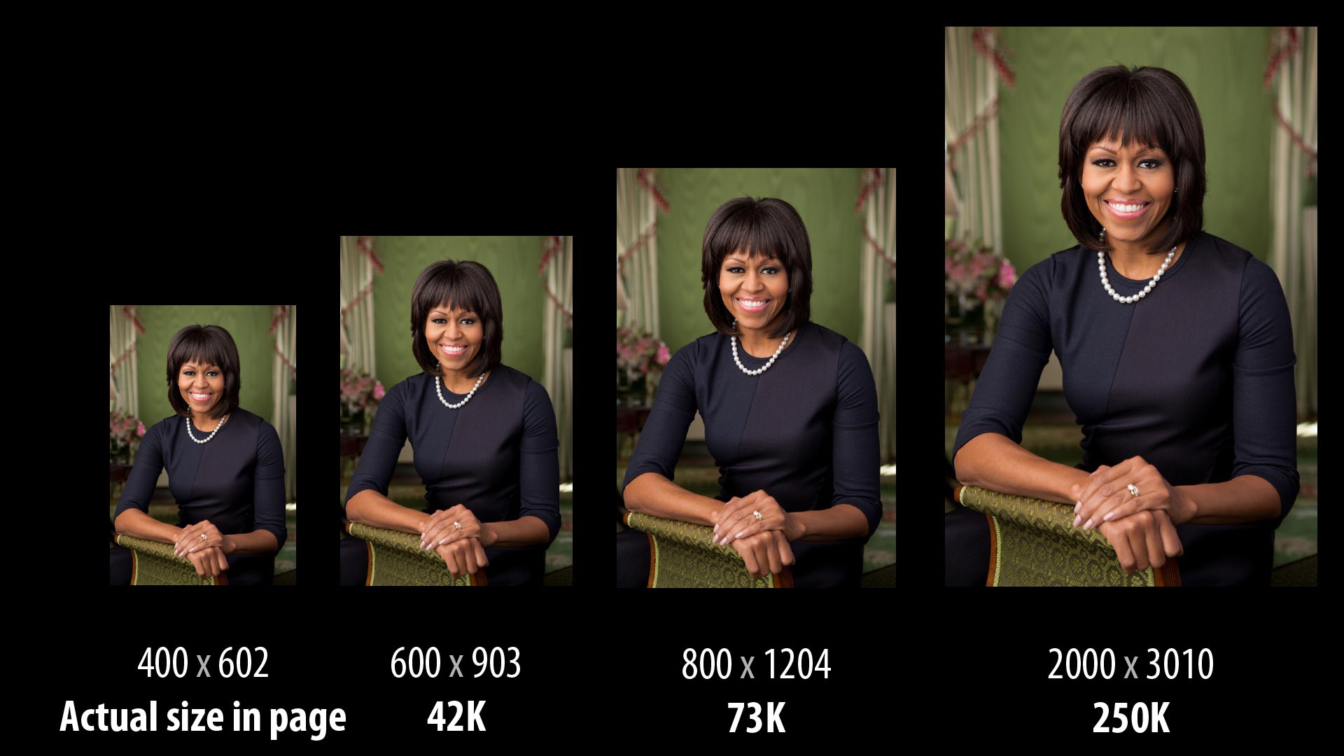
If we provided another image source that was 600×903 pixels wide, it would only be 42K. That saves us 31K (42%) from the 800×1204 image.
Well shoot. A savings of 42% is a big deal. Maybe we should keep going. 500 pixels wide? 450 pixels wide?
Each smaller image source offers the potential for substantial savings over the previous size. If we keep on this track, we eventually end up with an image source that is the exact size of the image in the page.
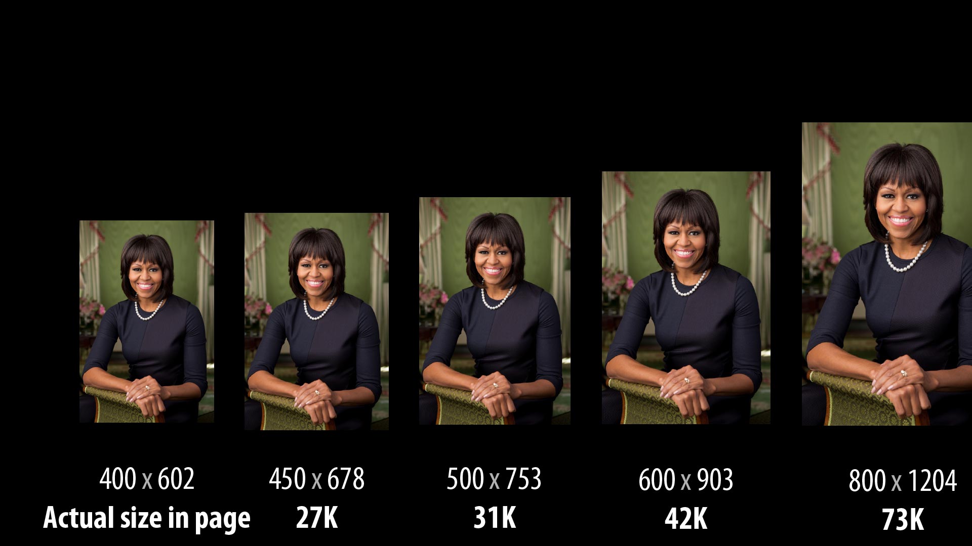
So here’s the question that has vexed me about image breakpoints. How do I know when an image source is too big for the size that the image is being used in the page?
The answer is that unless the image source matches exactly the size that the image is being displayed in the page, it is always going to be too big. There is always going to be an opportunity to optimize it further by providing a smaller image.
Why not provide the exact size of the image?
At this point, you may be wondering why we simply don’t provide the exact size of that the image is going to be used in the page.
First, the whole point of flexible images in responsive design is to provide images that scale as the size of the viewport changes. If we provided images that were exactly the size used in the page, we’d likely need to download new images whenever the viewport size changes or the device was rotated.
Second, it is unrealistic to provide images at any size imaginable. Yes, we can dynamically resize images, but when we resize images, the server needs to do that work which slows down delivery of that image to the browser.
For this reason, most larger sites cache images on content delivery networks (CDN). Caching every image size possible on the CDN would be incredibly expensive.
Finally, the browser doesn’t know the exact size of the image in the page when it starts downloading. That’s what got us to new responsive images standards in the first place!
Possible ways to pick image breakpoints
As I mentioned at the beginning, I have no rock solid solutions for how to pick the number of image sources that you need. Instead, I want to describe some different ways of looking at the problem that may help inform your decisions.
Winging it (aka, matching your layout breakpoints)
Someone on your team says, “Hey, how many source images do you think we need for these product photos?”
You ponder for a moment and say, “Hmm… how about three? Small, medium and large.”
Don’t be ashamed if you’ve done this. I’m pretty sure almost every person working on responsive images has done this at some point.
Perhaps your organization still thinks about mobile, tablet and desktop which makes small, medium and large make sense.
Or maybe you take a look at the range that the image will be displayed and make your best guess. Perhaps you simply look at the number of major layout breakpoints and decide to do the same for your image breakpoints.
I completely understand. And this is better than providing one huge image for all viewports.
But it sure would be nice to have more logic behind our decisions.
Testing representative images
If guessing doesn’t seem like a sound strategy, then let’s insert a little science into the art of picking image breakpoints. We can take a look at some representative images and figure out how many breakpoints they need.
The hardest part of doing this is determining representative images, or figuring out if you have any at all.
For some sites, all the photographs may have a particular style dictated by the brand. If that is the case, finding representative images is easy. Pick a few images and then resize them and save them at sizes ranging between the largest and the smallest images until you feel like you’ve got decent coverage.
Of course, if your site has a diversity of image styles, finding representative images can be nearly impossible.
Memory usage influencing the distribution of image breakpoints
Earlier this summer, Tim Kadlec gave a presentation on Mobile Image Processing. In that presentation, he took a look at the memory usage of flexible images in responsive designs.
What Tim showed is that as an image gets bigger, the impact of resizing an image gets larger.
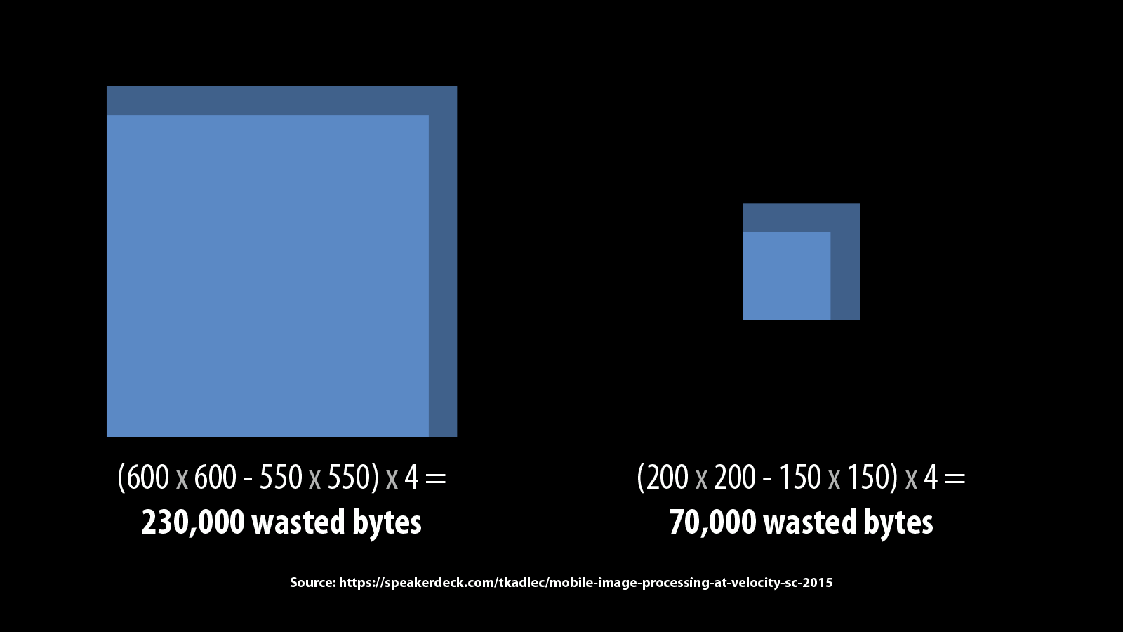
In the example above, reducing a 600×600 pixel image by 50 pixels in each direction results in 230,000 wasted bytes versus the 70,000 wasted bytes caused by reducing a 200×200 image by 50 pixels in the exact same way.
Knowing this tells us a bit about how we should pick our breakpoints. Instead of spacing out breakpoints evenly, we should have more breakpoints as the image gets larger.
Unfortunately, while this tells us that we should have more breakpoints at larger sizes, it doesn’t tell us where those breakpoints should be.
Setting image breakpoints based on a performance budget
What if we applied the idea of a performance budget to responsive images? What would that look like?
We’d start by defining a budget for the amount of wasted bytes that the browser would be allowed to download above what is needed to fit the size of the image in the page.
So say that we decided that we had a performance budget of 20K for each responsive image. That would mean that we would need to make sure that the various sources that we’ve defined for the image are never more than 20K apart.
When we do this, we find that the number of image breakpoints change wildly based on the visual diversity of the image and the compression being used.
Let’s take a look at three sample images.
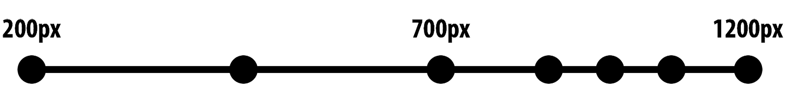
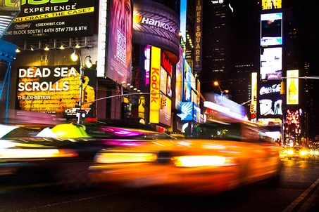
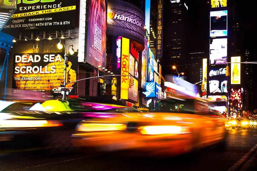
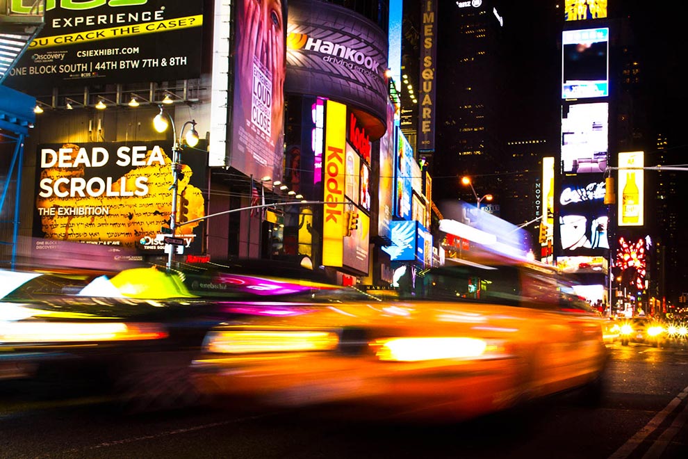
Time Square — 8 Image Breakpoints
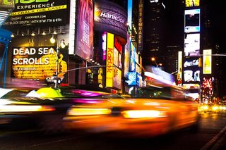
This image has a lot of visual diversity. The variations in colors and textures means that JPEG’s lossy compression cannot do as much without damaging the image quality.
Because of this, there are eight image breakpoints—set at 20k intervals—between the smallest size of the image (320×213) and the largest size of the image (990×660).
| Breakpoint # | Width | Height | File Size |
|---|---|---|---|
| 1 | 320 | 213 | 25K |
| 2 | 453 | 302 | 44K |
| 3 | 579 | 386 | 65K |
| 4 | 687 | 458 | 85K |
| 5 | 786 | 524 | 104K |
| 6 | 885 | 590 | 124K |
| 7 | 975 | 650 | 142K |
| 8 | 990 | 660 | 151K |
Morning in Kettering — 3 Image Breakpoints

Unlike the Times Square image, this image has a lot of areas with very similar colors and little variation. Because of this, JPEG can compress the image better.
On an image that can be compressed better, our 20K budget goes farther. For this image, we only need three image breakpoints to cover the full range of sizes that the image will be used at.
| Breakpoint # | Width | Height | File Size |
|---|---|---|---|
| 1 | 320 | 213 | 9.0K |
| 2 | 731 | 487 | 29K |
| 3 | 990 | 660 | 40K |
Microsoft Logo — 1 Image Breakpoint
This is a simple PNG8 file. At its largest size (990×660), it is only 13K. Because of this, it fits into our 20K budget without any modifications.
| Breakpoint # | Width | Height | File Size |
|---|---|---|---|
| 1 | 990 | 660 | 13K |
Take a look at the other images on a sample page we created. See how the number of breakpoints vary even through all the images start with the same resolution end points.
Now, I’m not suggesting that you manually decide on image breakpoints for every single image. But I can envision a future where you might be able to declare to your server that you have a performance budget of 20K for responsive images and then have the server calculate the number of image sources on a per image basis.
I’ve written in more detail about performance budgets for responsive images in the past. If you end up implementing this approach, please let me know.
Setting image breakpoints based on most frequent requests
At a recent Responsive Images Community Group (RICG) meeting, Yoav Weiss and Ilya Grigorik discussed a different way of picking image breakpoints based on the most frequently requested image sizes.
For both Yoav, who works at Akamai, and Ilya, who works at Google, one of the problems they see with multiple image sources is storing all of those sources on edge servers where storage is usually more limited and costs are higher.
Not only do companies like Akamai and Google want to reduce the number of images stored at the edge, but the whole purpose of their content delivery networks is to reduce the amount of time it takes for people to render a web page.
Therefore, if they can cache the most commonly requested image sizes at the edge, they will deliver the fastest experience for the majority of their users.
For these organizations, they can tie their image processing and breakpoints logic to their analytics and change the size of the images over time if they find that new image sizes are getting requested more frequently.
When combined with the new HTTP Client Hints feature that Ilya has championed, servers could get incredibly smart about how to store images in their CDNs and do so in a way that requires little to no decision-making by designers and developers.
Humans shouldn’t be doing this
I believe that in a few years time, no one will be talking about how to pick responsive image breakpoints because no one will be doing it manually.
Sure, we may still make decisions for images that fall into the art direction use case, but even then, we’re probably not going to make finite decisions about every image source. We’ll handle the places that require our intervention and let our image processing services handle the rest.
There is a ton of benefit to either picking image sources based on a performance budget or based on the frequency with which different sizes of the image are requested. But either of these solutions are untenable as part of a manual workflow.
In the future, our typical workflow will be that we upload the highest quality image source into our content management system or image processing system and never have to think about it again.
Part 10 of a 9-part series
This started as a 9-part series, but there is always more to discuss when it comes to responsive images. Read Part 10 for the conclusion of this series where I’ll provide some essential resources and talk about what the future holds for responsive images.
Responsive Images 101 Series
- Definitions
- Img Required
- Srcset Display Density
- Srcset Width Descriptors
- Sizes
- Picture Element
- Type
- CSS Responsive Images
- Currently Viewing:Image breakpoints
- Conclusion
Jason Grigsby is one of the co-founders of Cloud Four, Mobile Portland and Responsive Field Day. He is the author of Progressive Web Apps from A Book Apart. Follow him at @grigs.


