Responsive Images 101, Part 8: CSS Images

Most of the time when people refer to responsive images, they are referring to inline images, not CSS images.
This is because before <picture> and srcset there were no good solutions for inline responsive images. When it comes to CSS images, we could always use media queries. So why worry?
But now it is time to revisit responsive CSS images and look at the solutions anew based on what we’ve learned about inline images.
image-set() for resolution switching
Just like when we’re working with inline images, one of the first questions we’ll need to ask ourselves is whether we’re dealing with the resolution switching or art direction use case.
For resolution switching, we should strive to provide the browser with options and let the browser pick the best possible image. The browser is in a better position to know what image will work best based on user preference, network conditions, etc.
To provide the browser with options, we should use the image-set() syntax.
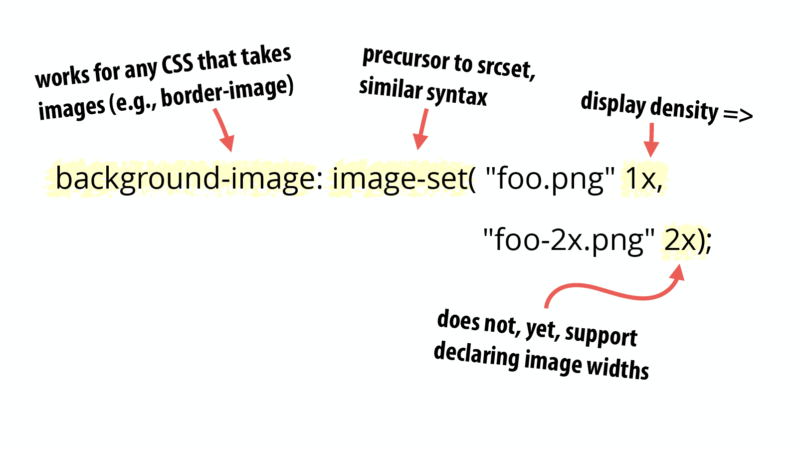
You may notice some similarity between image-set() and srcset. In fact, srcset was modeled after image-set().
background-image: image-set( "foo.png" 1x, "foo-2x.png" 2x);
Code language: CSS (css)
Like srcset, image-set’s value contains a comma-separated list of image URIs along with a display density descriptor. If a display density descriptor isn’t provided, it is assumed to be 1x.
However, image-set() does not support width descriptors yet. The plan is to refine image-set() to provide feature parity with srcset.
While most of the examples you will see for image-set() show it applied to background-image, it can be applied to any CSS property that accepts images.
image-set(): The forgotten responsive images standard
image-set() was the first responsive images specific syntax, and as mentioned, it was the foundation for srcset.
However, because we had solutions for CSS responsive images using media queries, image-set() was ignored by nearly everyone. The Responsive Images Community Group didn’t spend much time discussing it. Browsers didn’t prioritize implementing it.
Once we were nearing completion of the <picture> and srcset standards, we looked around and realized that we had neglected image-set(). Work is underway to increase the functionality of image-set() to bring it in line with srcset.
But as of publication, despite being the first responsive images standard, browser support for image-set() is lacking. It is available with a webkit prefix in Chrome, Opera, and Safari. Neither Firefox nor Microsoft have implemented it yet.
So why include it in this Responsive Images 101 series?
Because image-set() is the correct solution for resolution switching. When image-set() is widely supported, we should use it for all of the same reasons we use srcset instead of <picture> with the media attribute when we’re dealing with resolution switching.
Until image-set() is widely supported, you’ll probably end up using the CSS art direction solution for resolution switching.
Art direction
What is the CSS solution for art direction? Media queries.
It’s that simple. In fact, I’m going to assume you know media queries so no syntax sample here.
But as long as I’ve got your ear, make sure your media queries for images don’t overlap or you’ll end up with duplicate downloads. If you have any doubts, check out Tim Kadlec’s Media Query & Asset Downloading Results.
Resolution media queries
If you want to support high density displays in art direction, you’ll probably want to use the new resolution media queries.
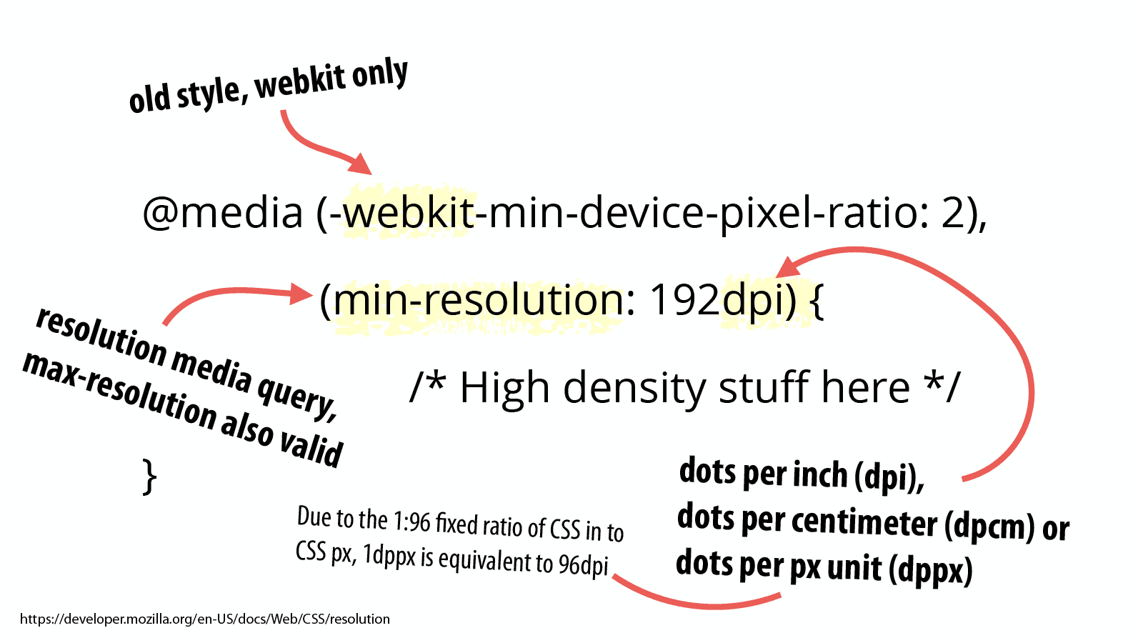
The resolution media query allows you to apply specific CSS rules to devices that meet the display density that you define.
@media (-webkit-min-device-pixel-ratio: 2), (min-resolution: 192dpi) {
/* High density stuff here */
}
Code language: CSS (css)
(Much thanks to CSS Tricks for this syntax sample.)
The first thing you’ll notice in the syntax above is that we’re including a -webkit prefixed media query. This is for devices that support the old device-pixel-ratio syntax. The only devices that got in the wild with this syntax used the -webkit prefix which is why it is the only one listed.
The syntax going forward is the resolution media query. In our example, we’re using min-resolution, but as you probably guessed, there is a complimentary max-resolution feature that can be used instead.
The resolution media query can check one of three things:
- dpi — dots per inch
- dpcm — dots per centimeter
- dppx — dots per px unit
The first two are fairly straight-forward, but I found dppx confusing. The Mozilla Developer Network documentation defines ddpx thusly:
This unit represents the number of dots per px unit. Due to the 1:96 fixed ratio of CSS in to CSS px, 1dppx is equivalent to 96dpi, that corresponds to the default resolution of images displayed in CSS as defined by image-resolution.
Confused? I certainly was when I first read it.
Here’s the way I’ve begun to think about it, the idea of 1x, 2x, 3x, etc. is based on an imprecision. The value of 1x on some devices is different than others because some devices are 72dpi or 96dpi or whatever.
But from a CSS perspective, these differences don’t matter. The CSS Working Group has decided that there will always be a 1:96 fixed ratio of CSS inches to CSS pixels.
So while 1x might leave things up to interpretation because of 72dpi vs. 96dpi screens, 1dppx will always be what you and I think of as “1x”.
You may be asking yourself, why was 1x sufficient for srcset and image-set, but for min-resolution, it was necessary to use dppx?
I don’t know. All I know is that you can think of 1dppx as 1x, 2dppx as 2x, and so on. At this point, I’ve just accepted the inconsistency and decided to move on with my life. I recommend you do the same. 😉
Now comes the hard part
Believe it or not, responsive images syntax is the easy part. In Part 9, we’ll discuss the vexing challenge of picking your image breakpoints.
Responsive Images 101 Series
- Definitions
- Img Required
- Srcset Display Density
- Srcset Width Descriptors
- Sizes
- Picture Element
- Type
- Currently Viewing:CSS Responsive Images
- Image breakpoints
- Conclusion
Jason Grigsby is one of the co-founders of Cloud Four, Mobile Portland and Responsive Field Day. He is the author of Progressive Web Apps from A Book Apart. Follow him at @grigs.


