Responsive Images 101, Part 7: Type

So far we’ve been focused on how to make responsive images more performant. That’s essential, but at the end of the day, we still have the same old image on the page.
Now, it is time for the fun stuff!
Type attribute
Have you ever bemoaned the fact that your options for reliable image formats are limited to jpg, png, and gif? Ever wanted found yourself wondering if there is enough browser support for new formats like SVG or webp?
If so, you’re going to love the type attribute.
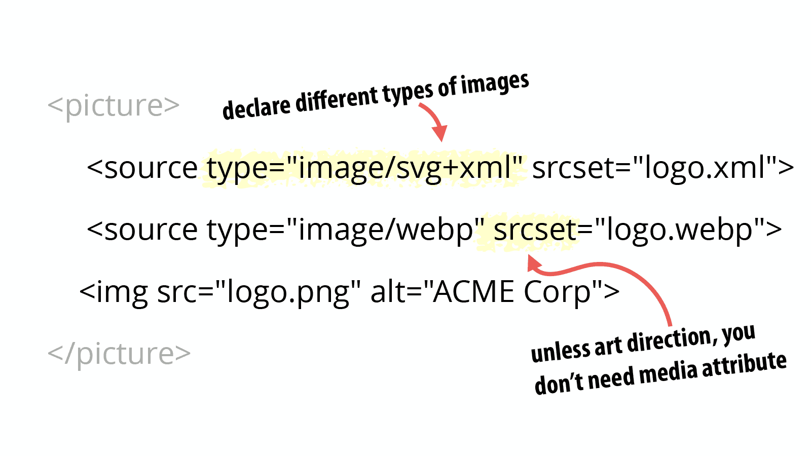
The type attribute can be added to <source> elements inside a <picture> element and allows you to declare different image types that the browser can choose from:
<picture>
  <source type="image/svg+xml" srcset="logo.xml">
  <source type="image/webp" srcset="logo.webp">
  <img src="logo.png" alt="ACME Corp">
</picture>
Code language: HTML, XML (xml)
This new type attribute is modeled on the <video> element’s type attribute and works the same way.
The browser will pick the first source where the declared image type is one that it supports. If it doesn’t recognize any of the source types, it will use the <img> element’s src or srcset declarations.
The value is a MIME type for the image format being referenced in the srcset attribute. If you have multiple image URIs listed in the srcset attribute, they should all match the declared image MIME type.
Of course, you can combine type with the sizes and/or the media attributes as well. All three of these attributes are optional and can be combined to accomplish whatever you need.
The srcset attribute is required for all <source> elements. Both display density and width descriptors can be used with the type attribute.
Do you need the media attribute?
I’ve gotten in the habit of telling people that they shouldn’t use the <picture> element for most responsive images. That is both true and a bit misleading.
So now that you’re up to speed on all of the inline responsive images techniques, let’s break it down:
- Most images on the web fit the resolution switching use case.
- When you’ve got a resolution switching use case, you want to empower the browser to make the best choice possible. This is what srcset is designed to do.
- When you use the <picture> element with media attributes, you’re dictating to the browser what images it should use.
Therefore, you can and should use <picture> when you want both resolution switching and to support multiple image formats. Just leave off the media attribute so that the browser can do its thing.
Progressive enhancement for image formats
So far in this series, I’ve tried to keep things professional, but lighthearted. But that ends here because…
OMG! OMG! OMG! I’M SO BLOODY EXCITED ABOUT TYPES!
Phew, had to get that out of my system.
For years we’ve wanted to be able to use different image formats, but had to wait for wide spread adoption of the format.
But even when we finally felt we could switch, we always knew that we were ignoring old browsers. We’d chalk it up to progress and hope it didn’t affect too many people. Or maybe we never switched to the new image formats for fear of leaving people out.
But <picture> plus the type attribute gives use a way out of this conundrum. We can use progressive enhancement for image formats right now.
Sara Soueidan described how she is starting to do this for SVG with PNG fallbacks instead of all the hacks we used to use.
But it’s not just SVG and webp. What about JPEG-2000? JPEG-XR? APNG?
If you can find browsers that support an image format and you believe it can provide some value to your users, then there is no reason not to use that format so long as you provide alternatives.
JPEG-2000? Yes please!
A wonderfully in-depth article by Zoltan Hawryluk opened my eyes to the benefits of different image formats and in particular JPEG-2000 for alpha transparency images.
In one of the examples in Zoltan’s article, he shows dice placed above a multi-color background. To pull it off requires an alpha-channel transparency.
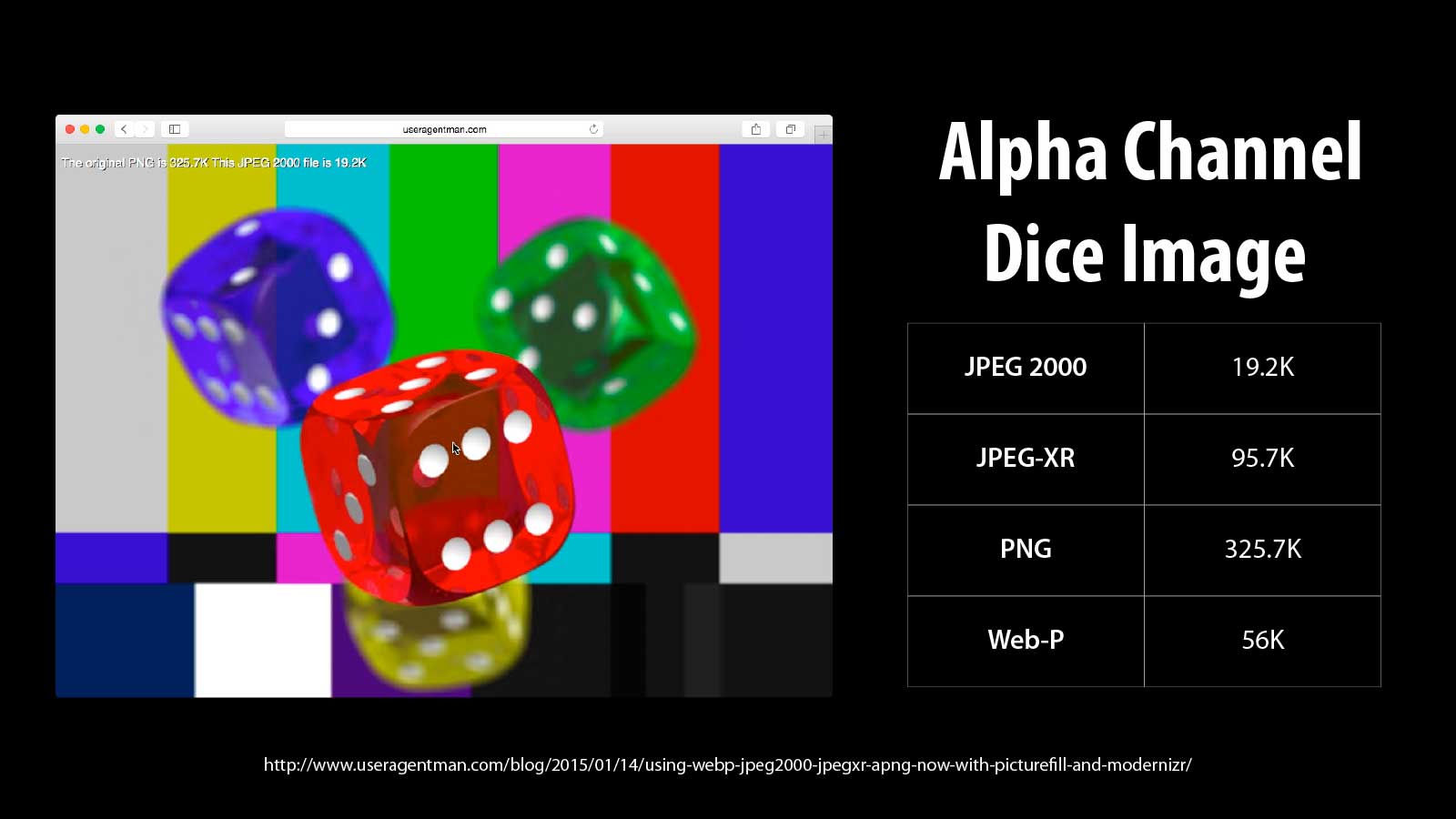
The file sizes of the dice image are:
| JPEG 2000 | JPEG-XR | PNG | WEBP | |
|---|---|---|---|---|
| 320×240 | 2K | 22.6K | 55.2K | 112.1K |
| 600×450 | 13.5K | 48.5K | 14.3K | 26.6K |
| 1024×768 | 19.2K | 95.7K | 325.7K | 56K |
Look at those savings. The dice PNG at 1024×768 is 325.7K. The same image as JPEG-2000 is only 19.2K. That’s insane!
I know what you’re thinking. That’s wonderful, but no browsers support JPEG-2000.
That’s what I thought too, but I was wrong. Both desktop and Mobile Safari already support JPEG-2000.
Now before you go converting all of your images to JPEG-2000, heed Zoltan’s warning:
As you can see, the numbers for JPEG-2000 are especially impressive. However, the file sizes of the alternate images will vary depending on the characteristics of the original image… While alternative image formats may give better results, sometimes they don’t.
So it will depend on the image and the design. But you can see how there can be significant benefits for some of your users depending on the types of images and the formats their browsers support.
Brave new world of image formats
I don’t expect anyone to go off and immediately start using JPEG-2000. There’s a lot more work to be done in this space so that we know what image formats make sense and when to use them.
Simply getting tools in place to output the various images formats can be difficult. Zoltan includes information at the bottom of his article on what tools he used to create the different formats.
Other than the command-line tools, I find the tools to be awkward and rough around the edges. There has been no incentive for companies like Adobe to add rich support for image formats like JPEG-2000 because no one could use them until now.
We have a lot of experimenting to do. I can’t wait!
What about CSS?
Everything we’ve talked about so far has been for inline responsive images. Because we already had media queries in CSS, inline responsive images were the biggest challenge and most of the focus has been on them.
But there are some new standards for responsive images in CSS and a few tricks you should know. Continue on for Part 8: CSS Responsive Images.
Responsive Images 101 Series
Jason Grigsby is one of the co-founders of Cloud Four, Mobile Portland and Responsive Field Day. He is the author of Progressive Web Apps from A Book Apart. Follow him at @grigs.


